
Research
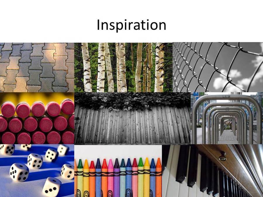
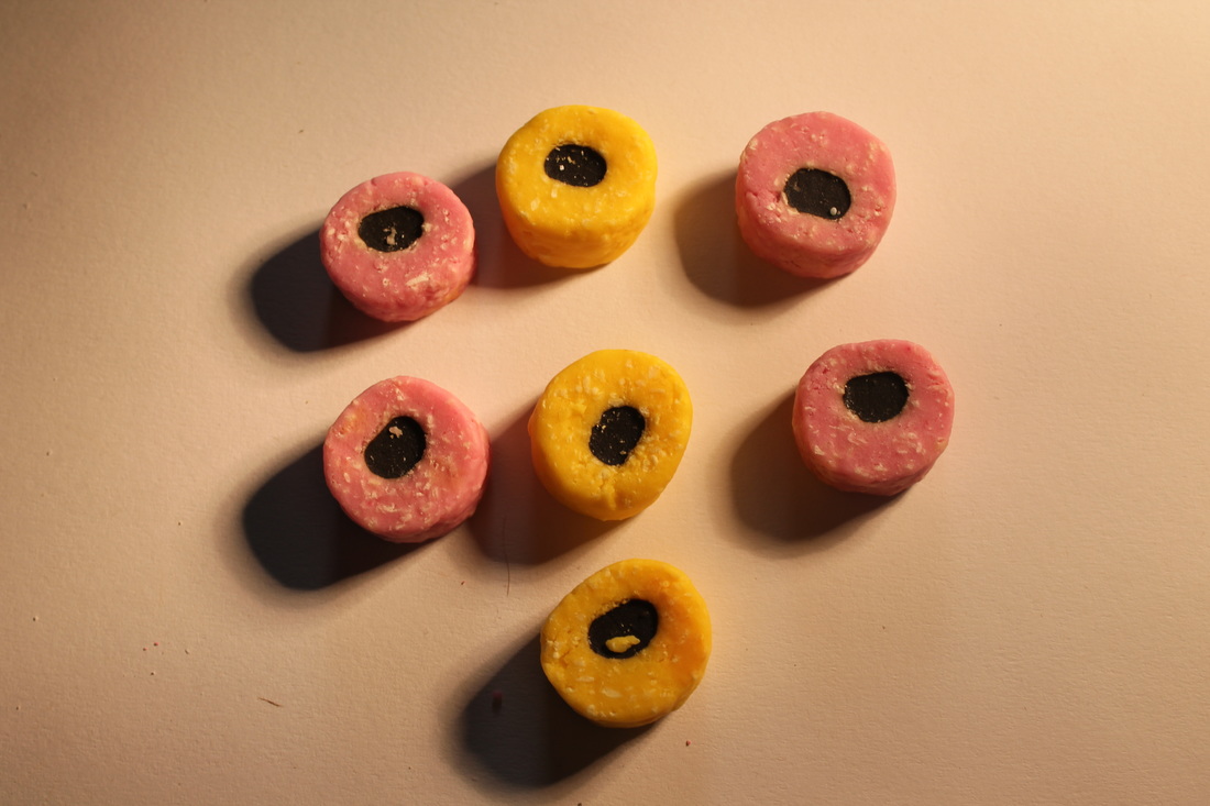
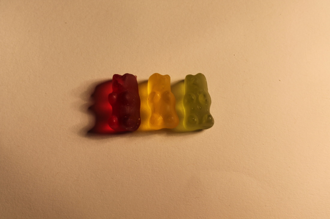
I am choosing to do repetition because I enjoy the methodical process involved and the patterns that can be made. I will be using a variety of colours in my photographs to enhance the visual qualities of a photograph. I am drawing particular inspiration from Lisa Milroy as I find the way she arranges objects inspiring and interesting.
Initial ideas:

Resolving my ideas:
|
|

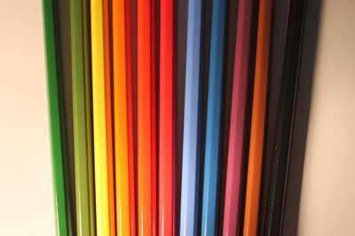
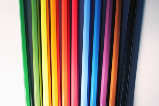
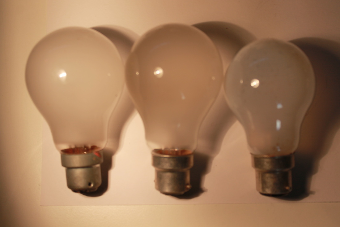
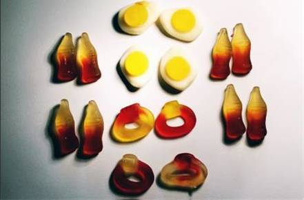
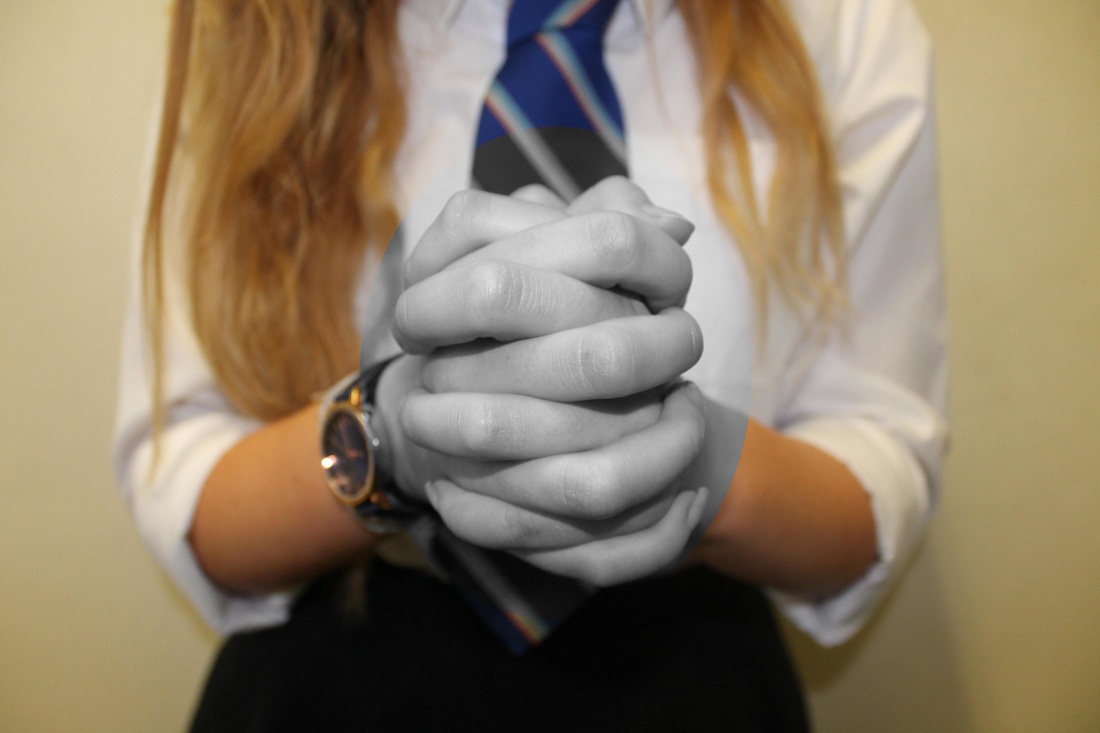
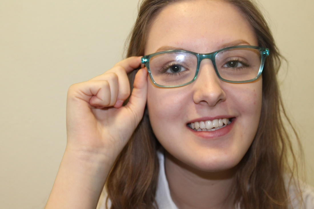
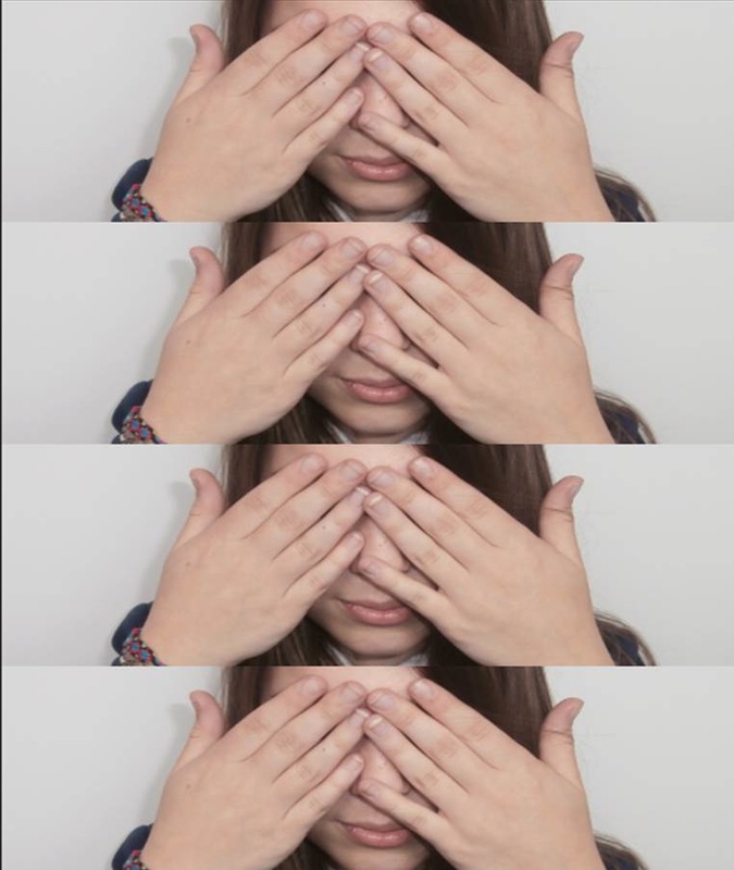
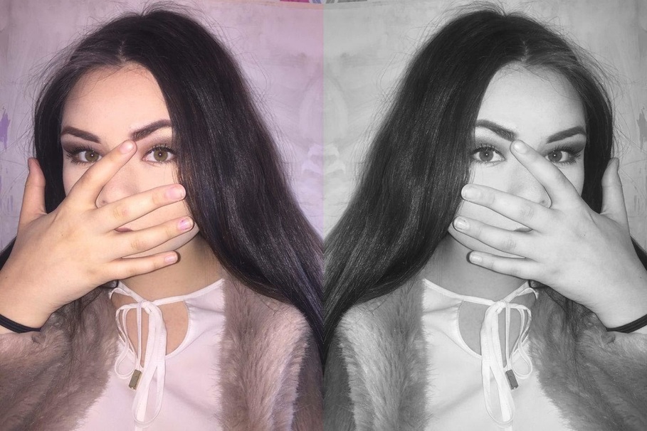
I changed the colour of the background to white to make the colours of the pencil stand out.
|
|
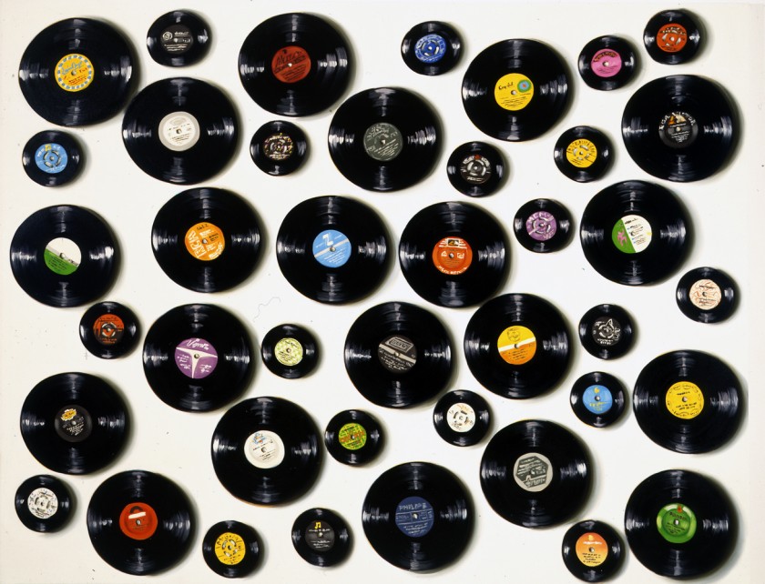
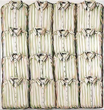
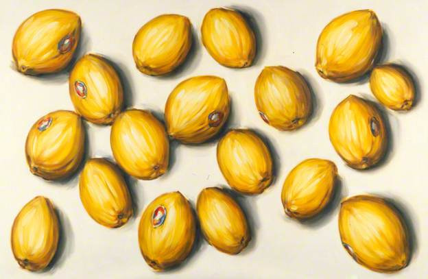
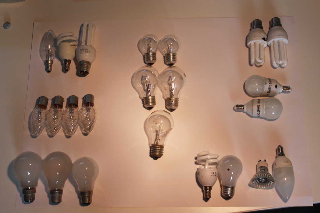
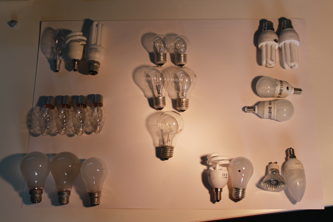
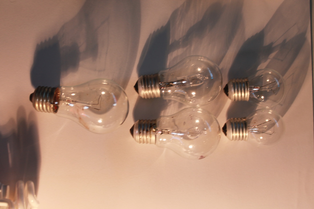
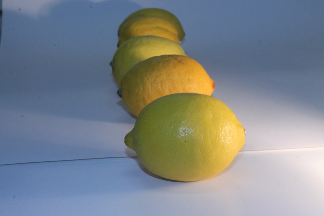
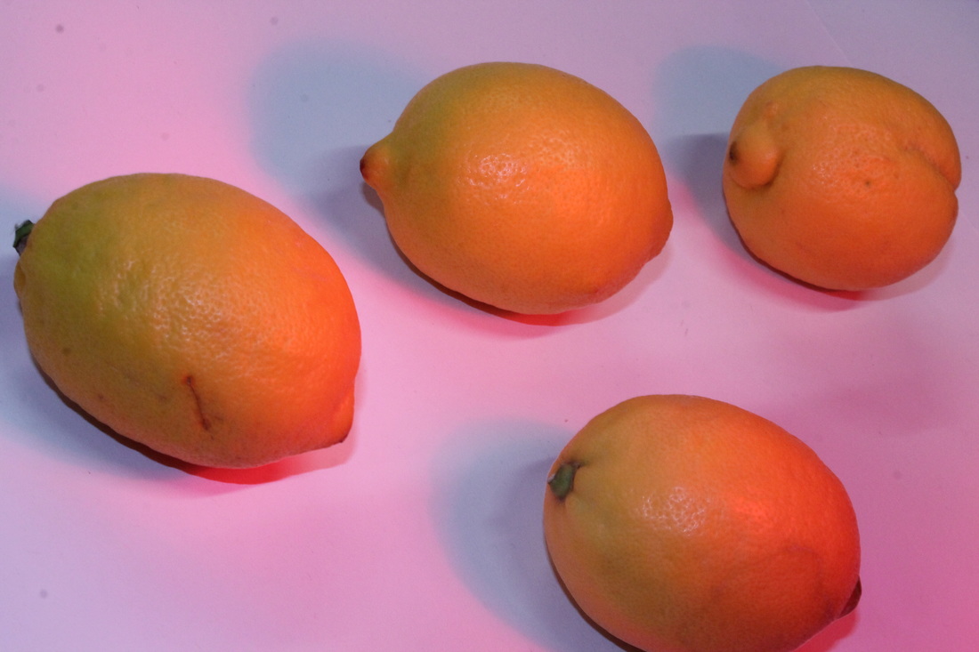
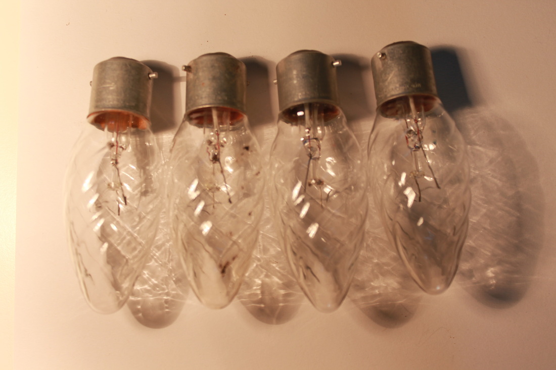
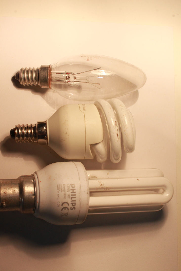
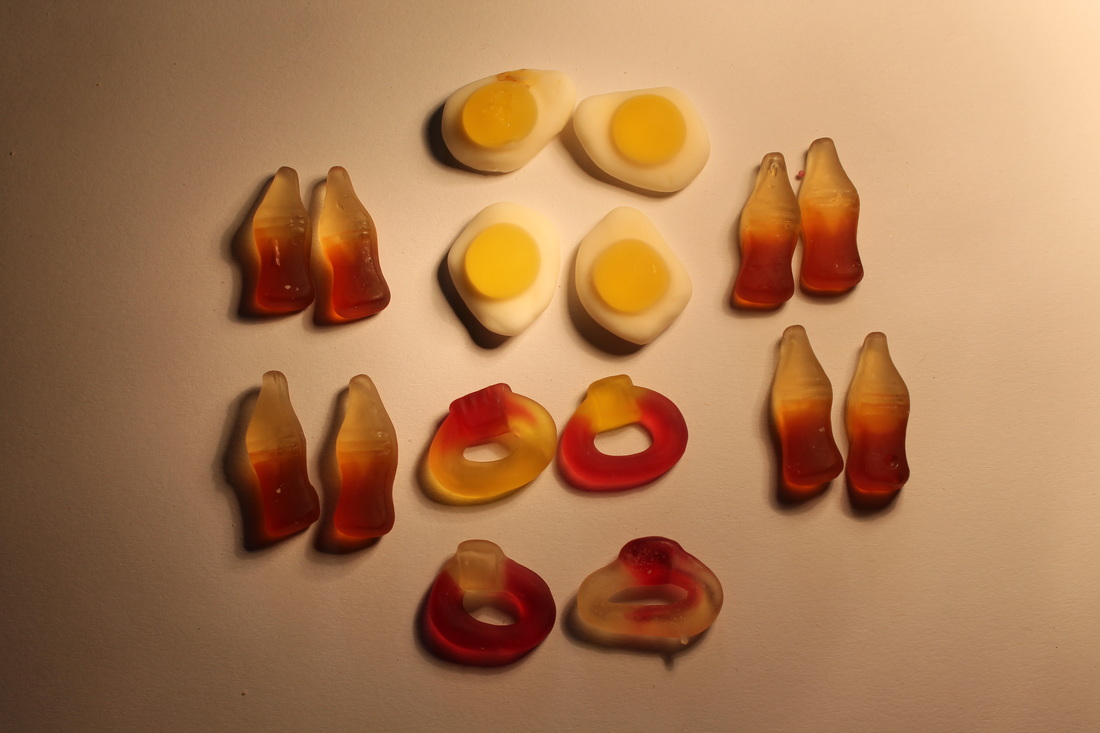
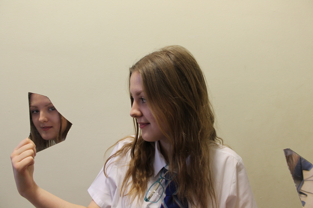
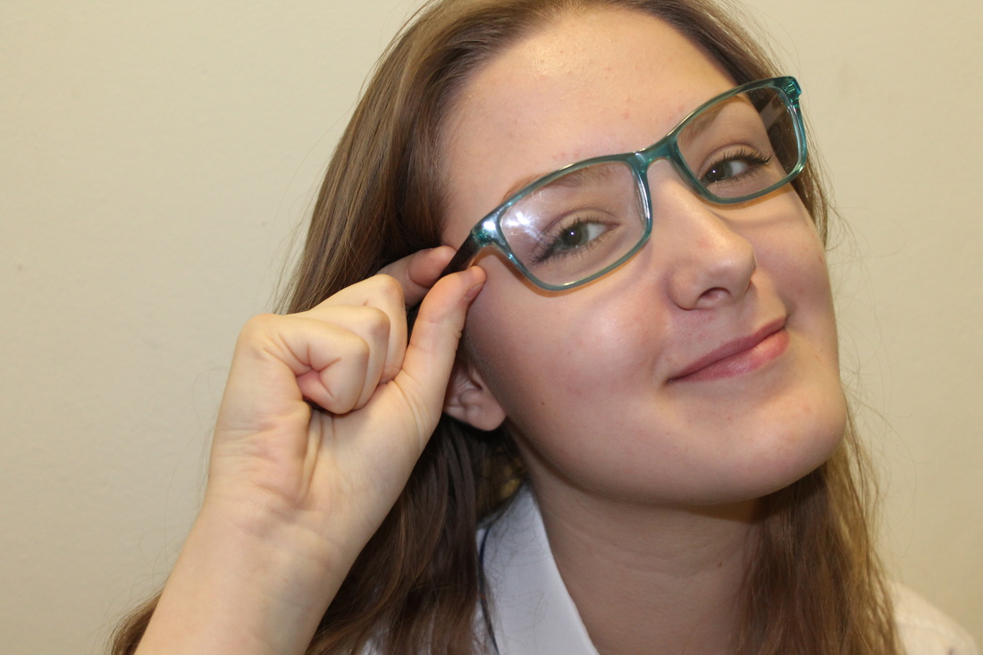
Lisa Milroy
My response to repetition


Refining my ideas
|
|
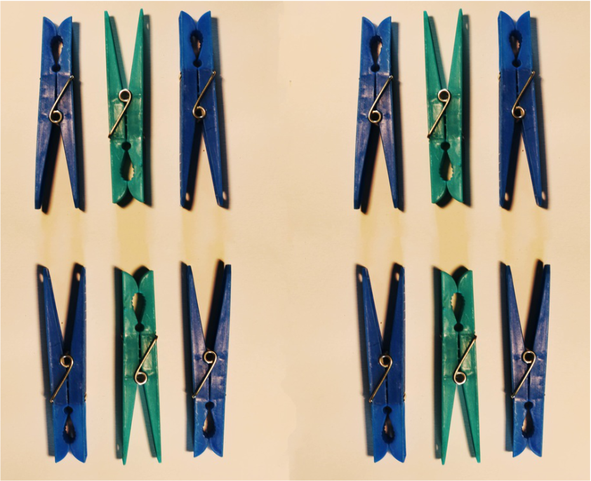
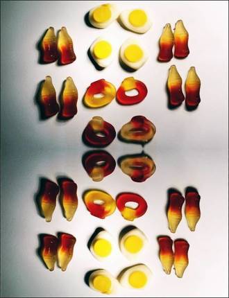
I wanted to enhance the repetition in this photo by repeating the photo but rotating every other degrees by 180 degrees to create a pattern. I used the flat white background to link the photo to Lisa Milroy.
|
|
|
|
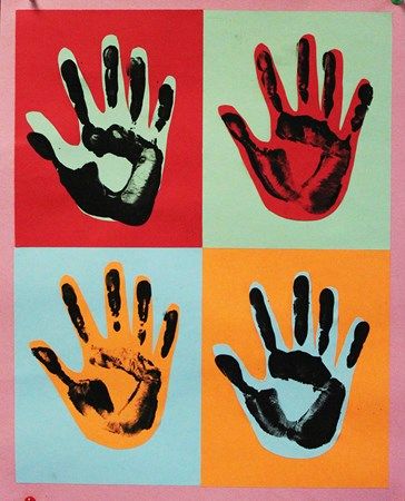
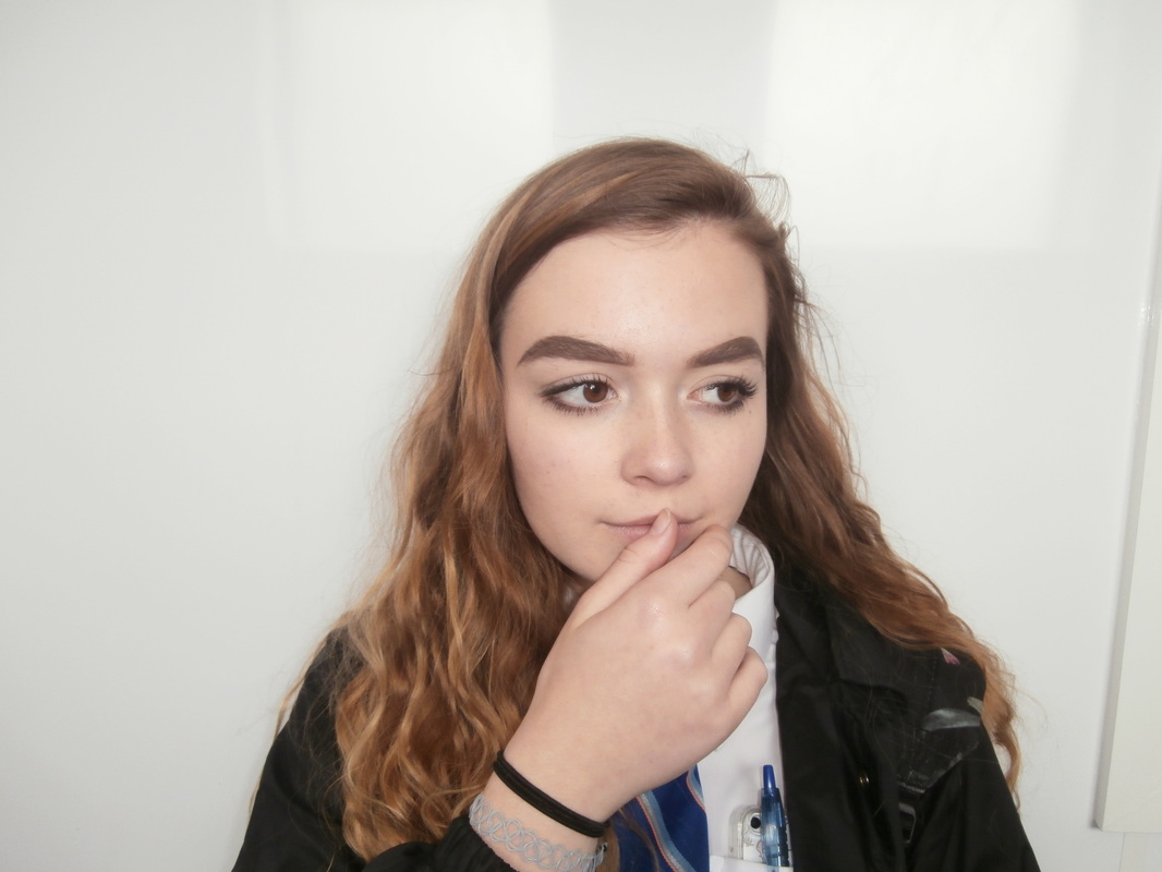
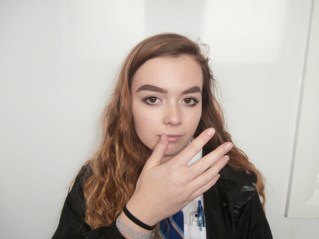
John Makepeace
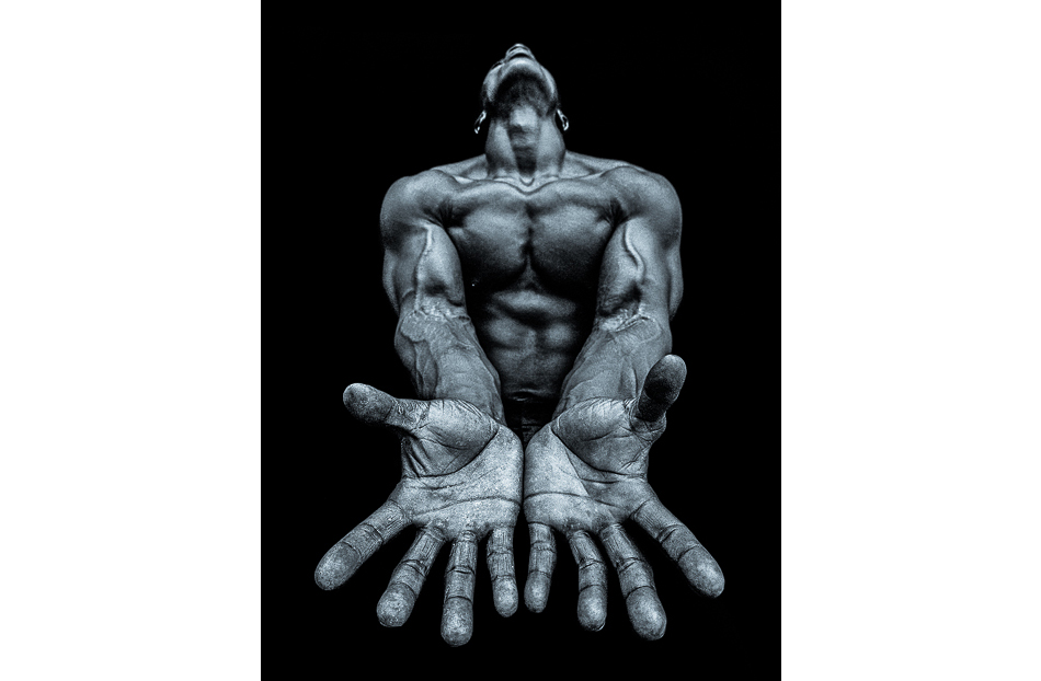
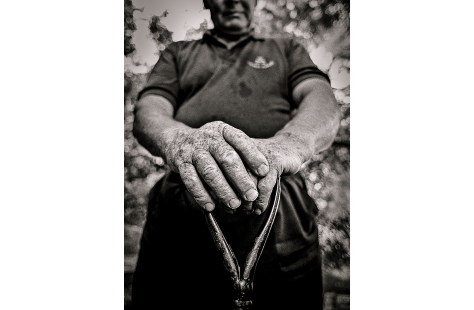
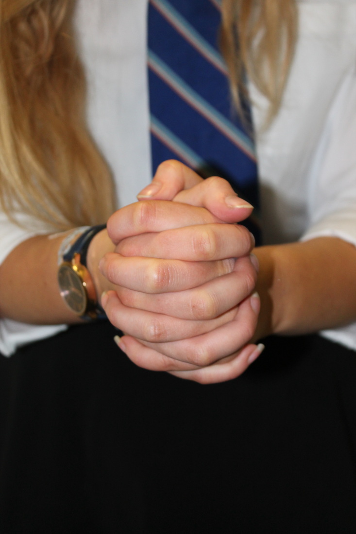
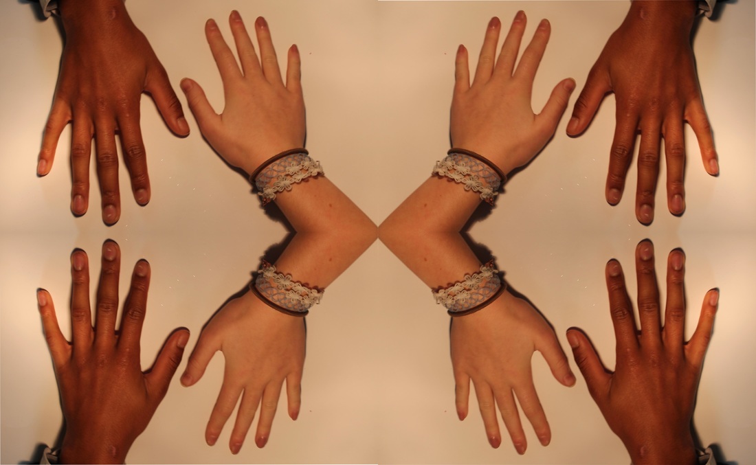
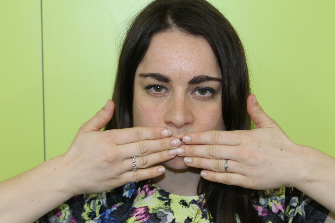
I like his photography as it has a lot of meaning behind it. It shows how although everyone has hands and fingers they're all unique and mean different things. For example the one in the middle is called 'The Decider' and this photo symbolizes this, as his hands are in the position of someone who is thinking and deciding. This contrasts with the photo on the right, as the photo is called ' The Grave Digger' meaning his hands deal with tough labour work, digging and lifting. You can see the physical difference in the hands that everyone has, and it's contrasting uses, that is why I like this photography.

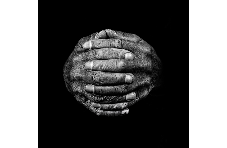
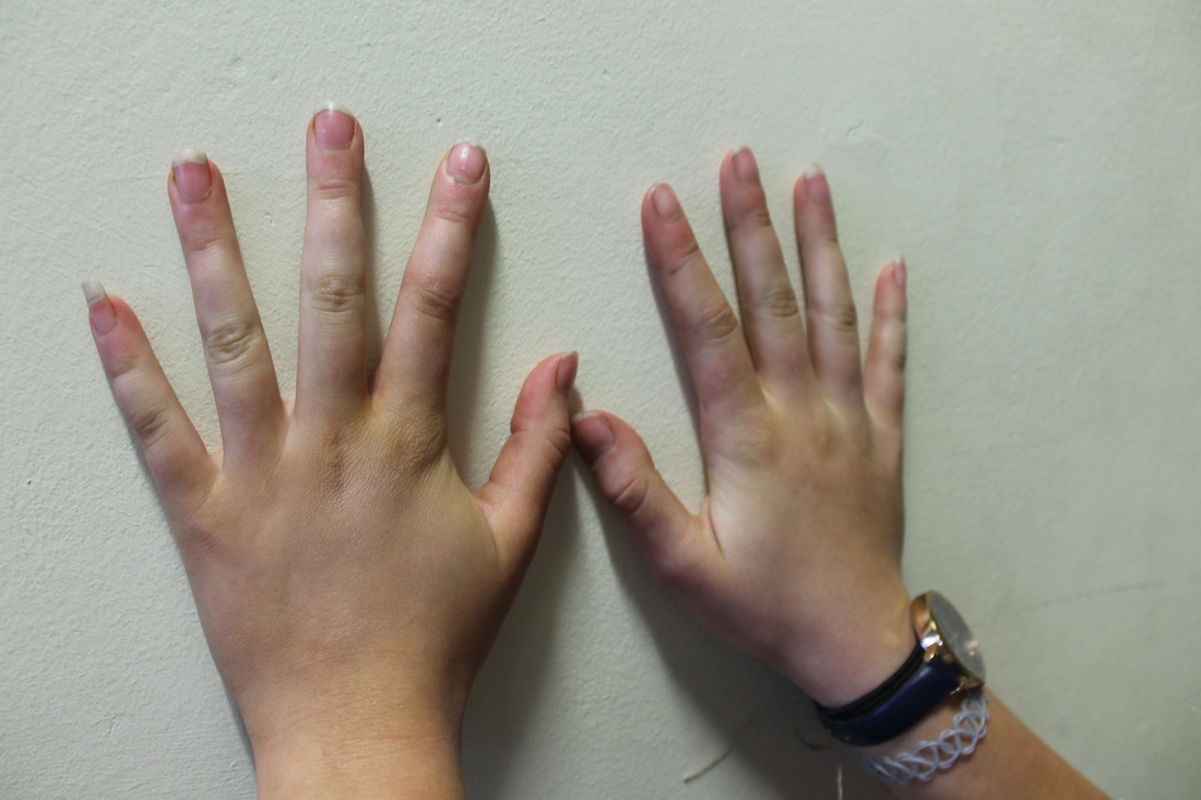
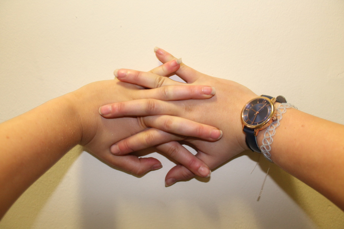
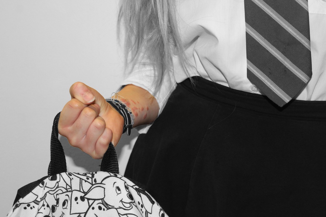
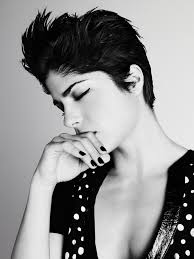
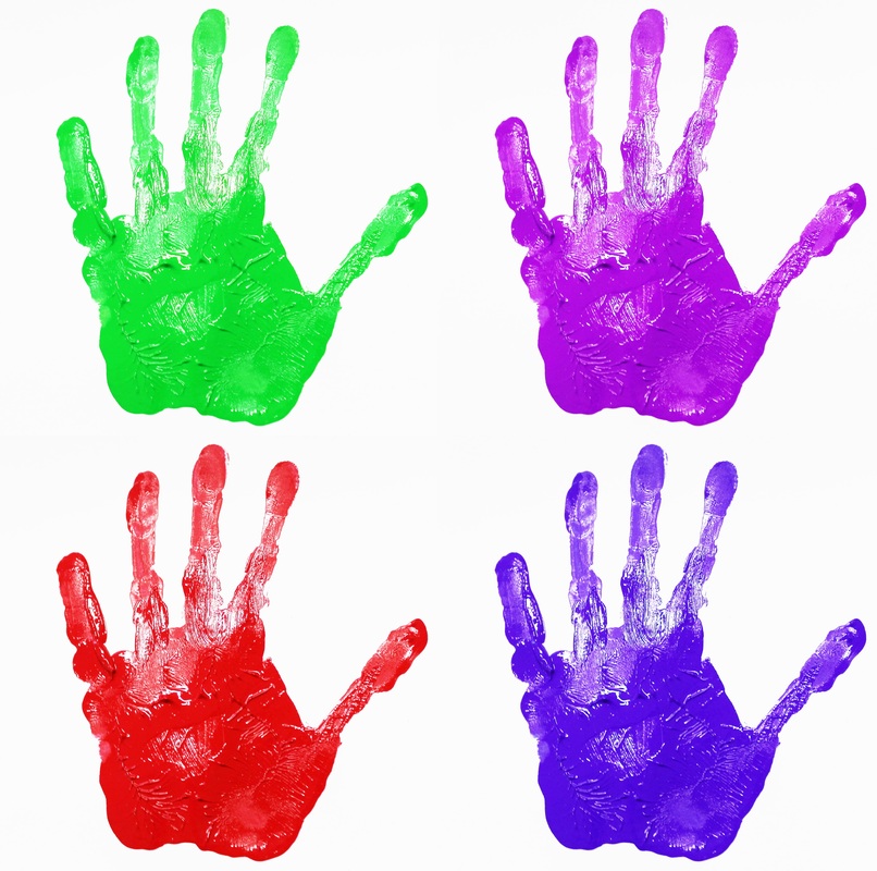
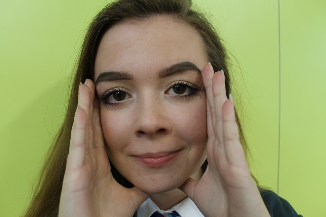
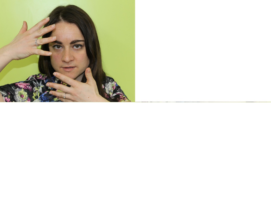
I like this photograph specifically because it links to my scheme of repetition. This close up on the hands shows the repetition and pattern of fingers. Repetition is shown clearly by making a pattern with the fingers.
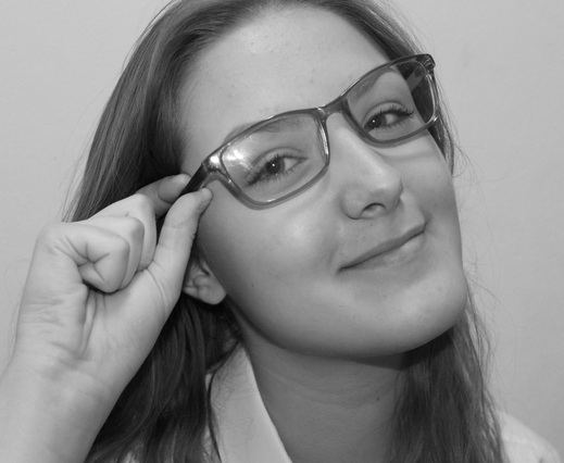
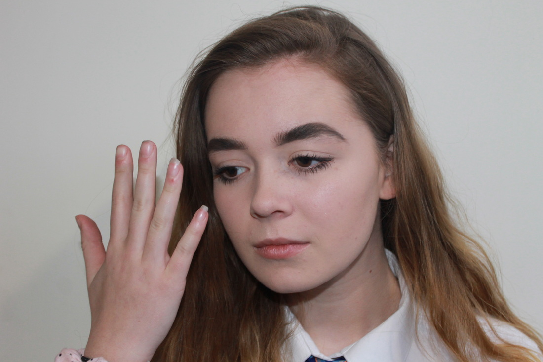
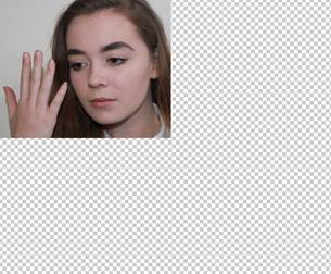
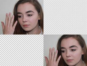
My response to John Makepeace

Refining my ideas
|
|
|
|
|

|
|
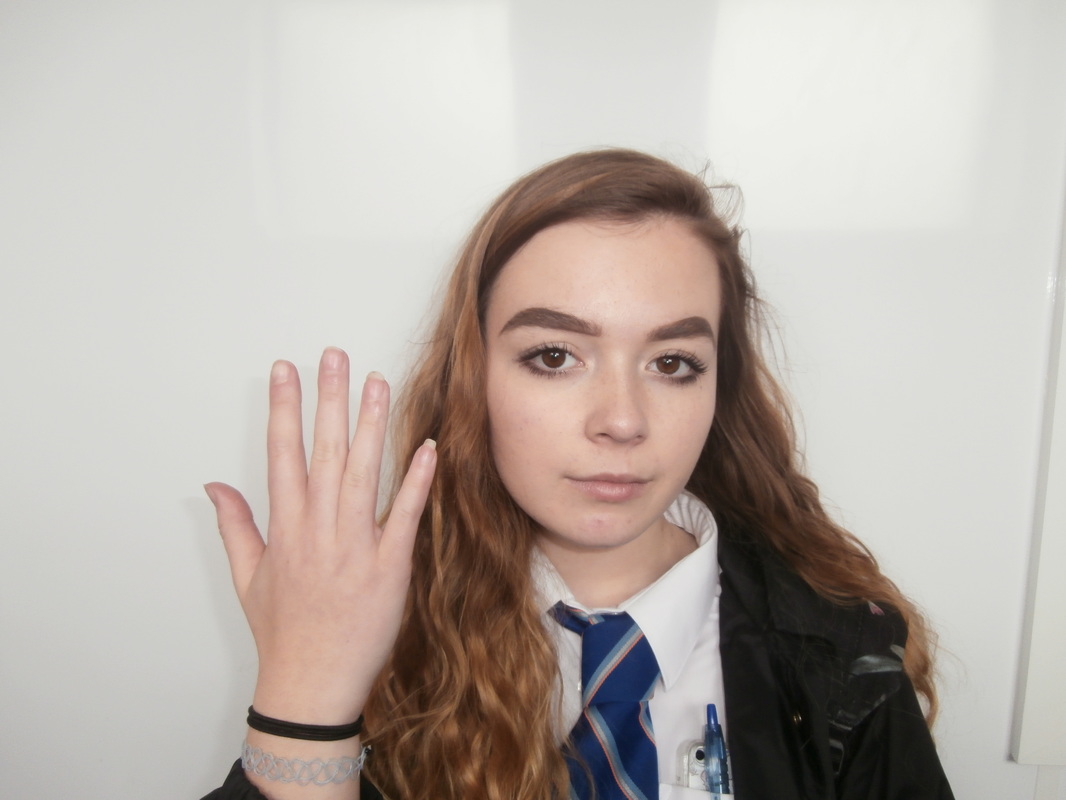
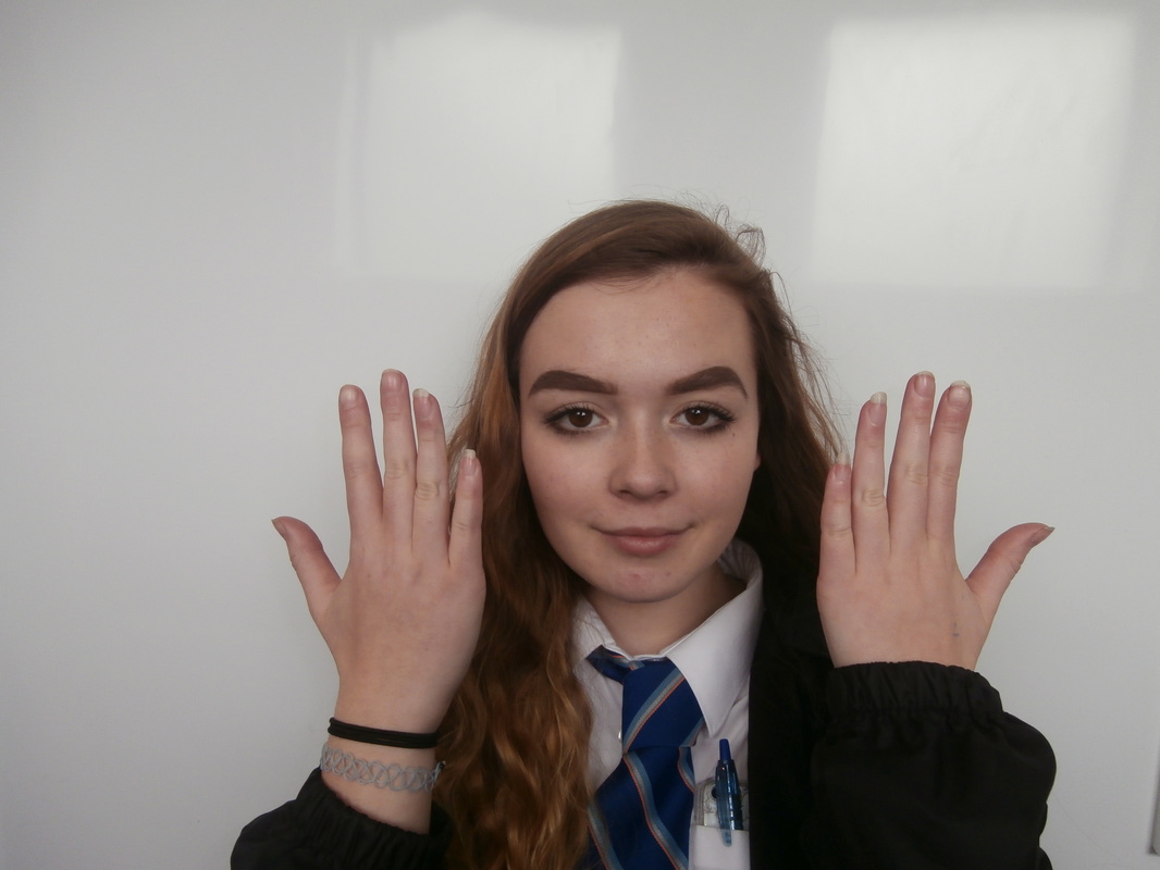
Rankin
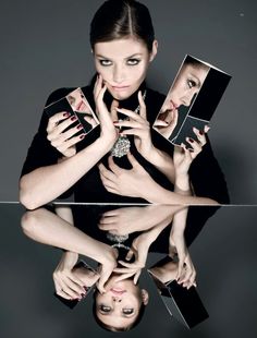
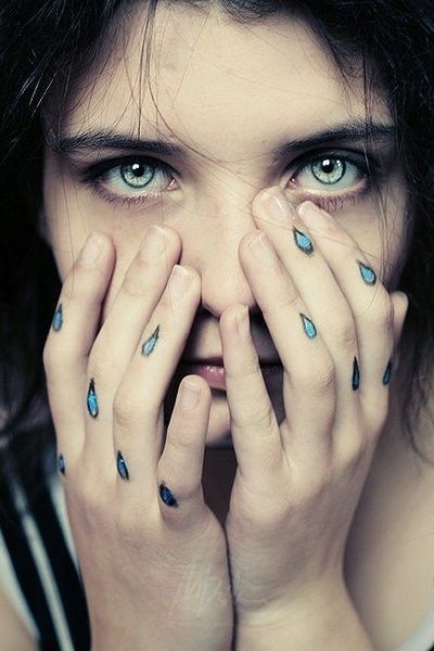
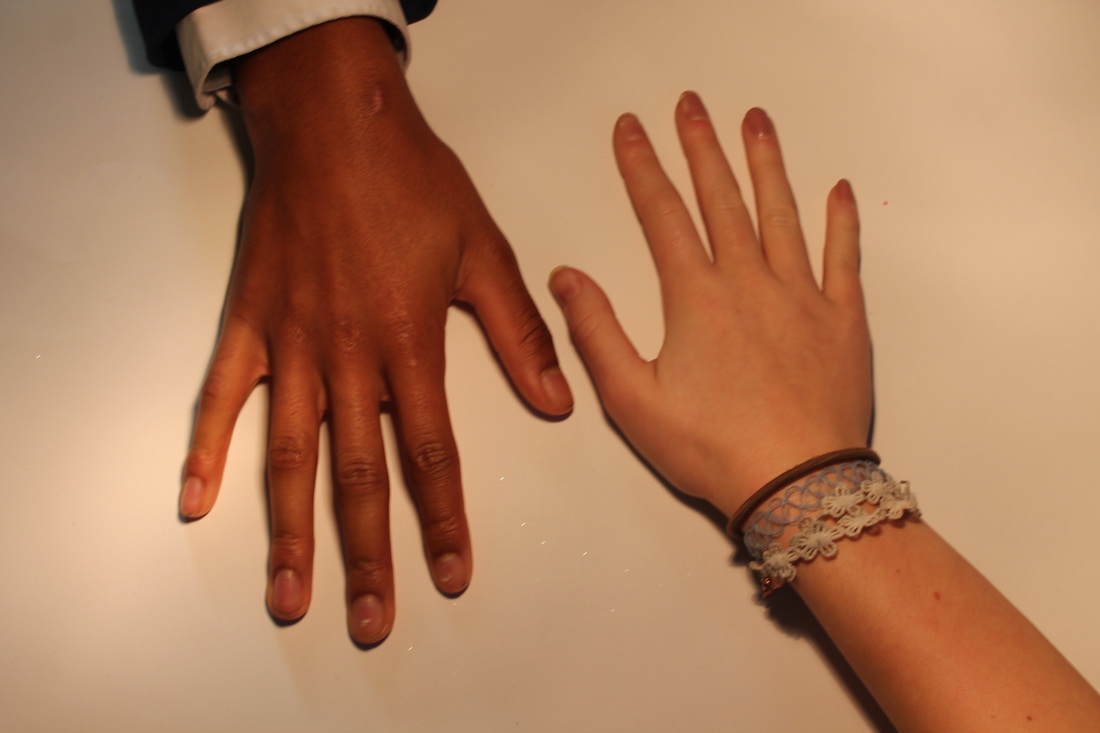
Rankin's focus on hands is quite significant in these photos. Rankin takes portraits of people and the photo is meant to represent them as a person. The use of hands is similar to Makepeace's photography as although everyone has hands,he has shown them in different ways, unique to each person. He has included hands into the portraits as hands also represent us as individual people, we use our hands everyday to rest our put on make up, rest our heads, cover our faces or wipe our tears away.
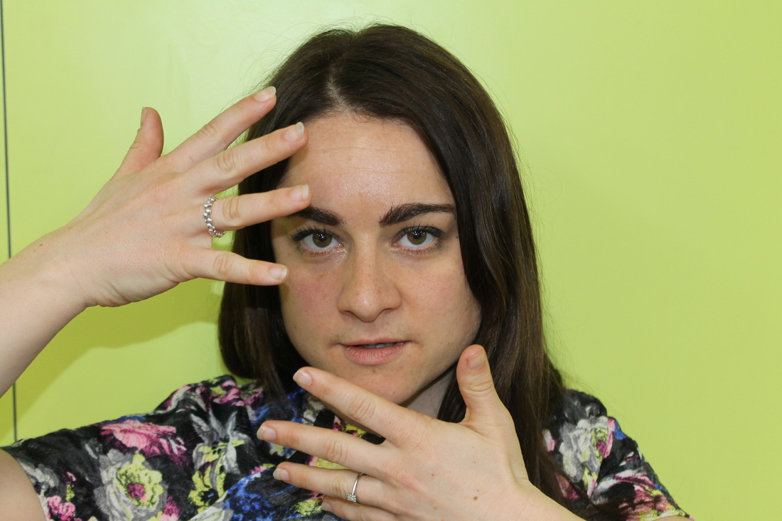
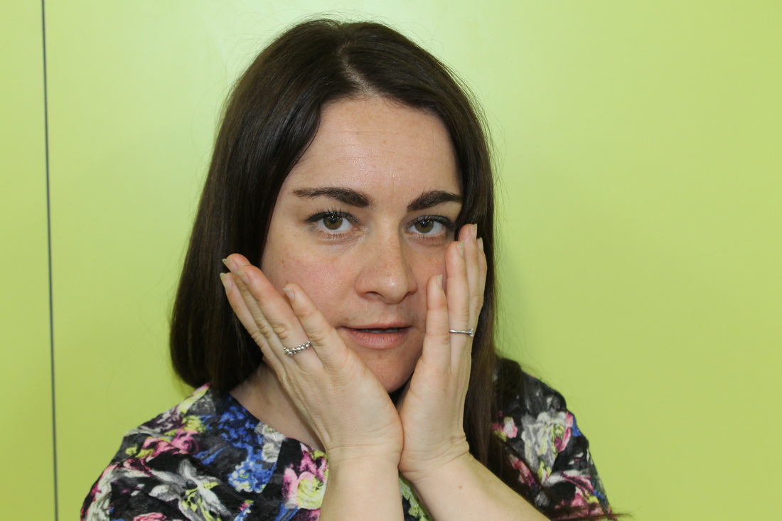
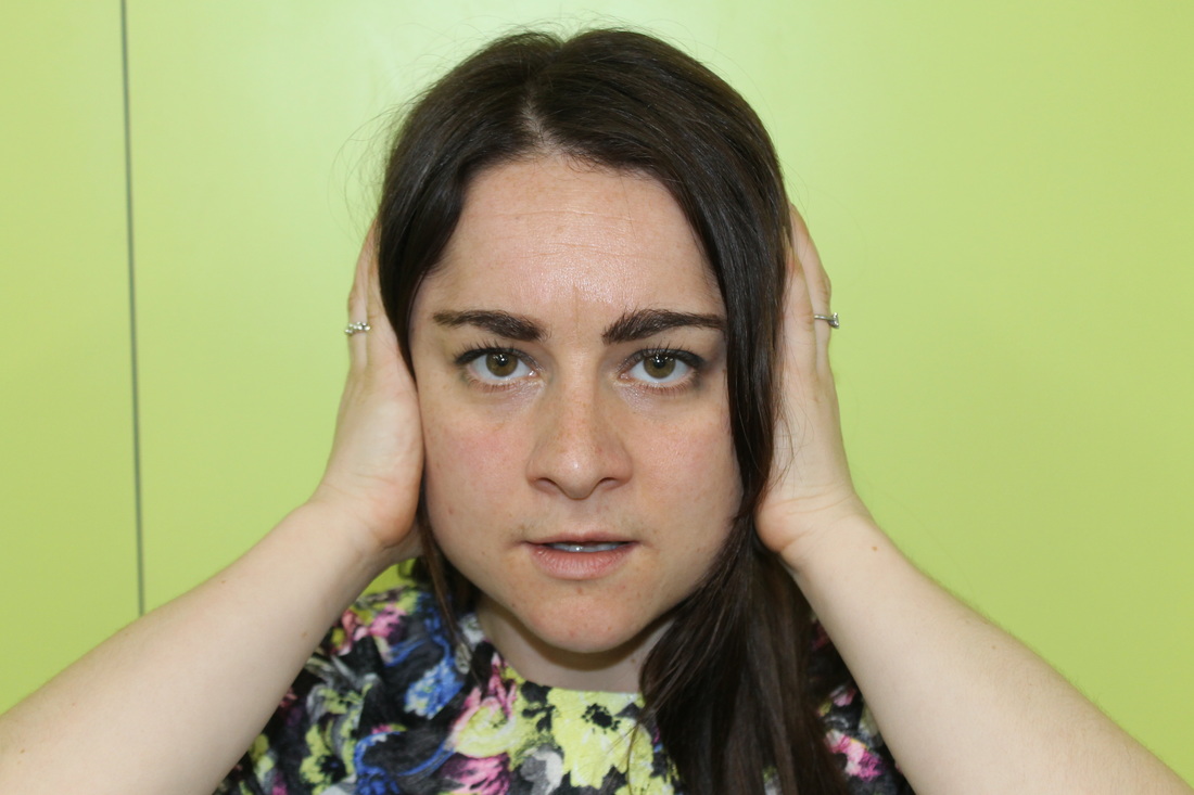
My response to Rankin


Refining my ideas
|
|
|
|

|
|
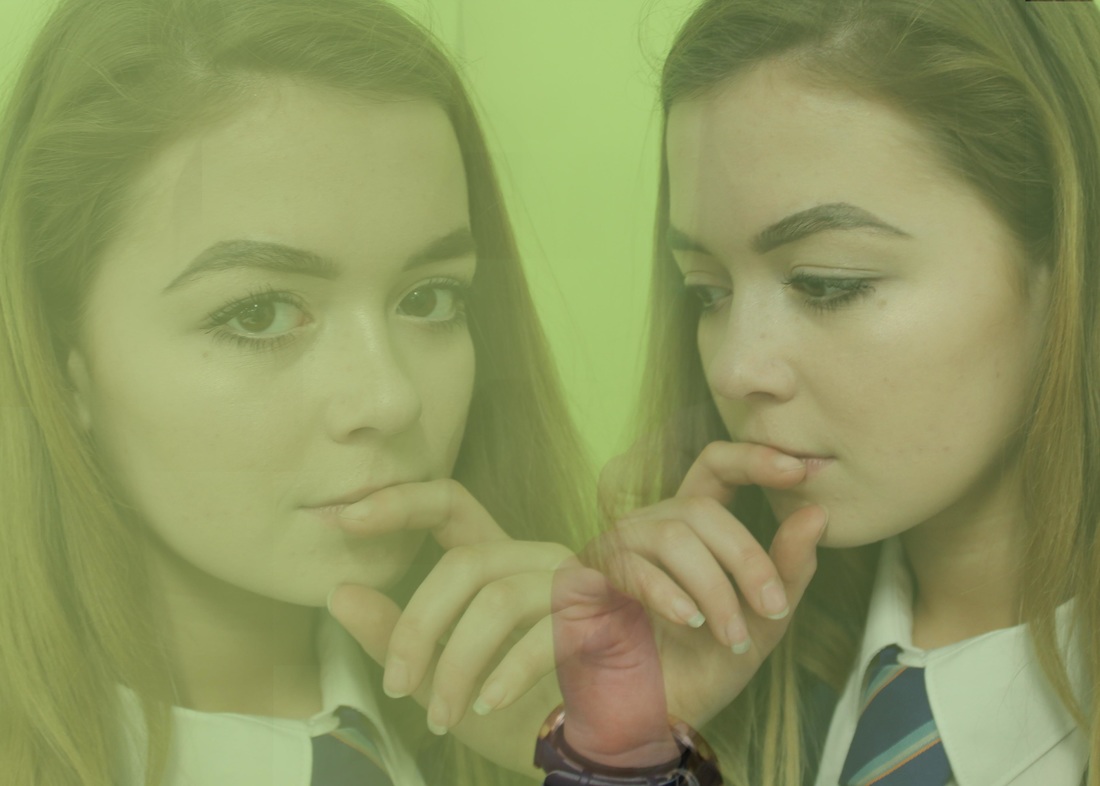
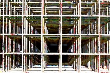
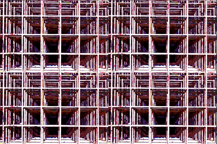
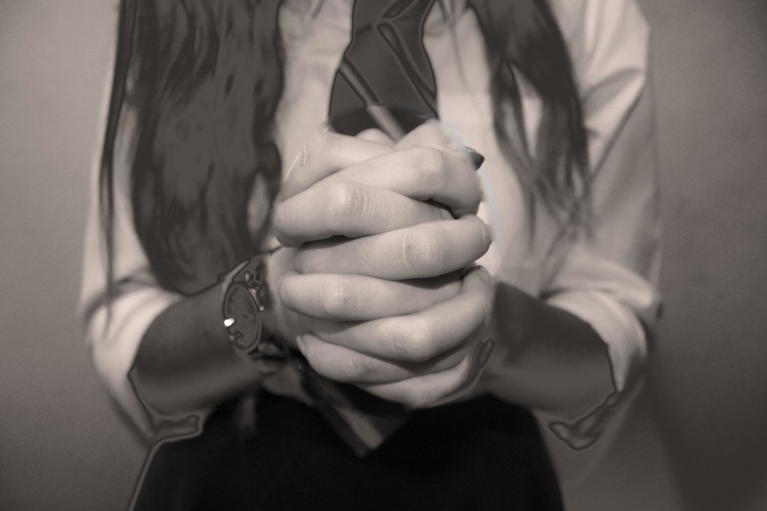
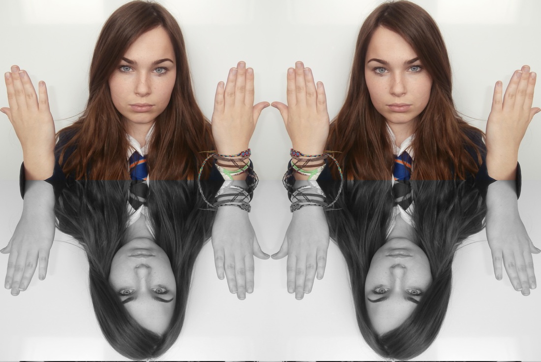
Here I have edited in the style of Alexey Titarenko, a style called ghosting. By editing this photo this way I have been able to show repetition of a similar photo.
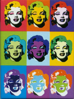
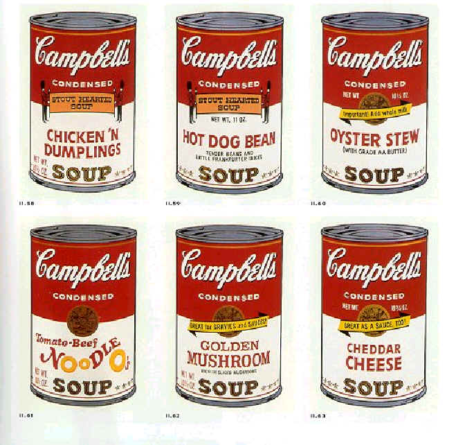
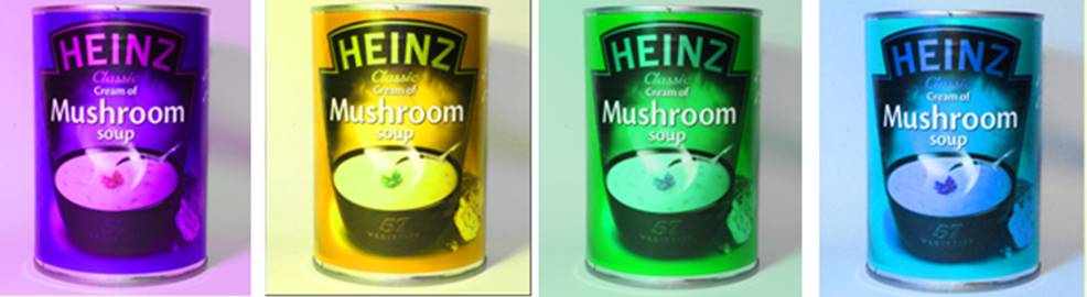
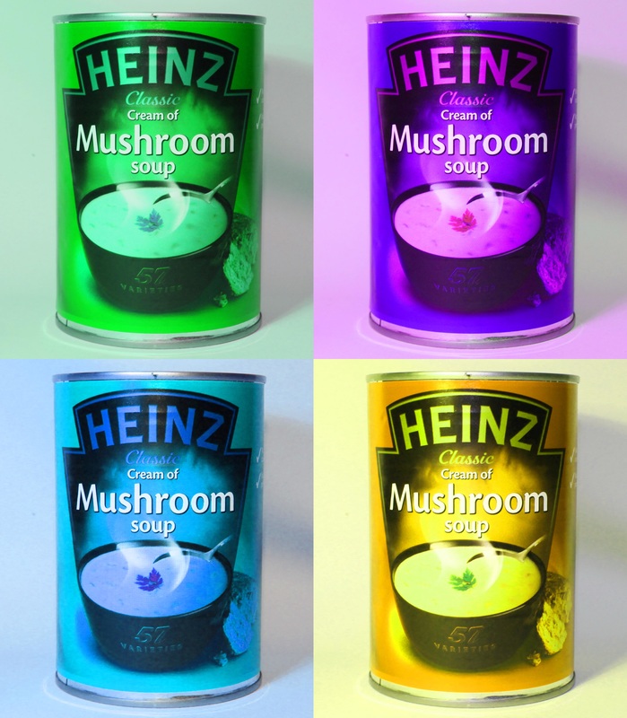
Andy Warhol
My response to Andy Warhol
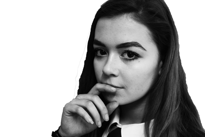
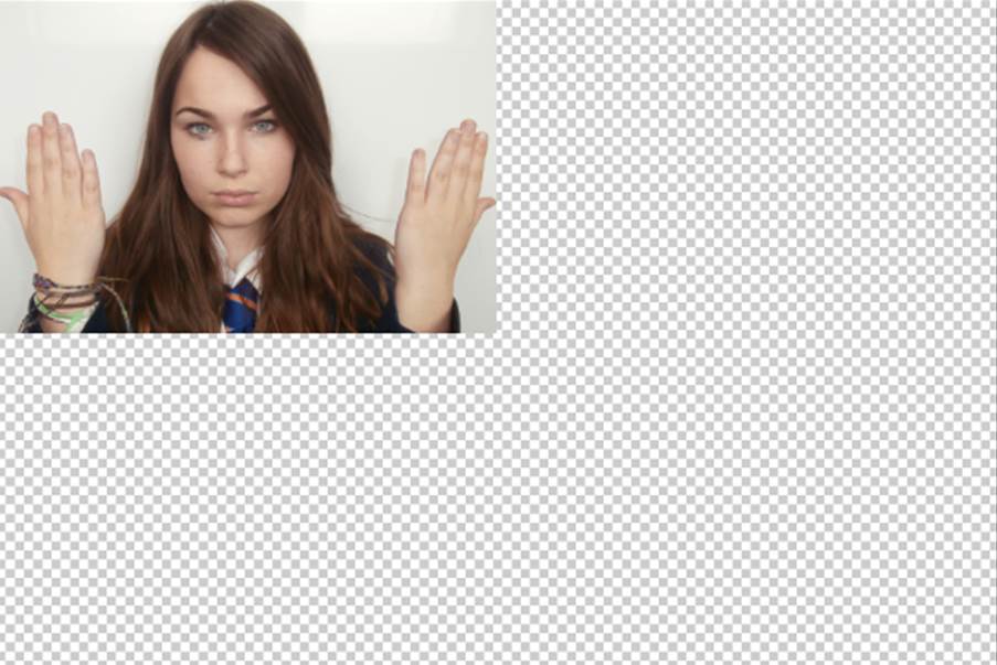
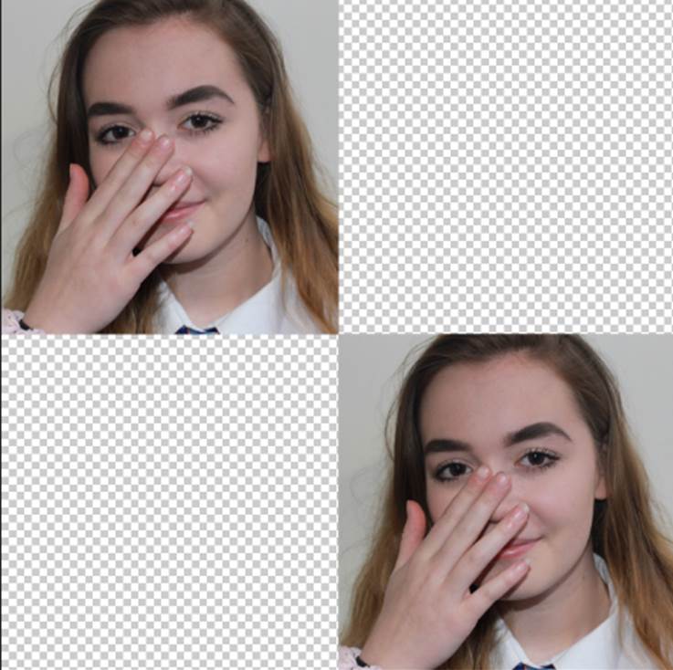
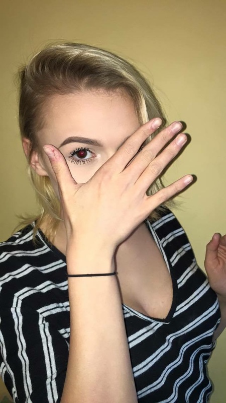
Original photos:

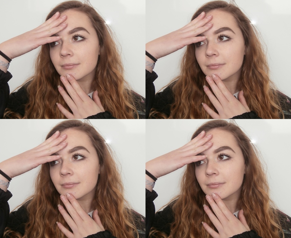
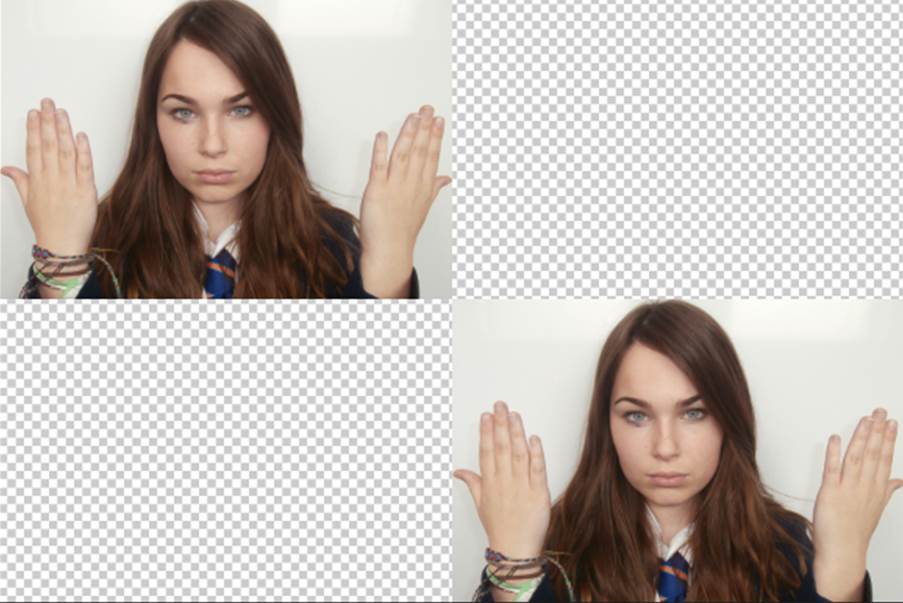
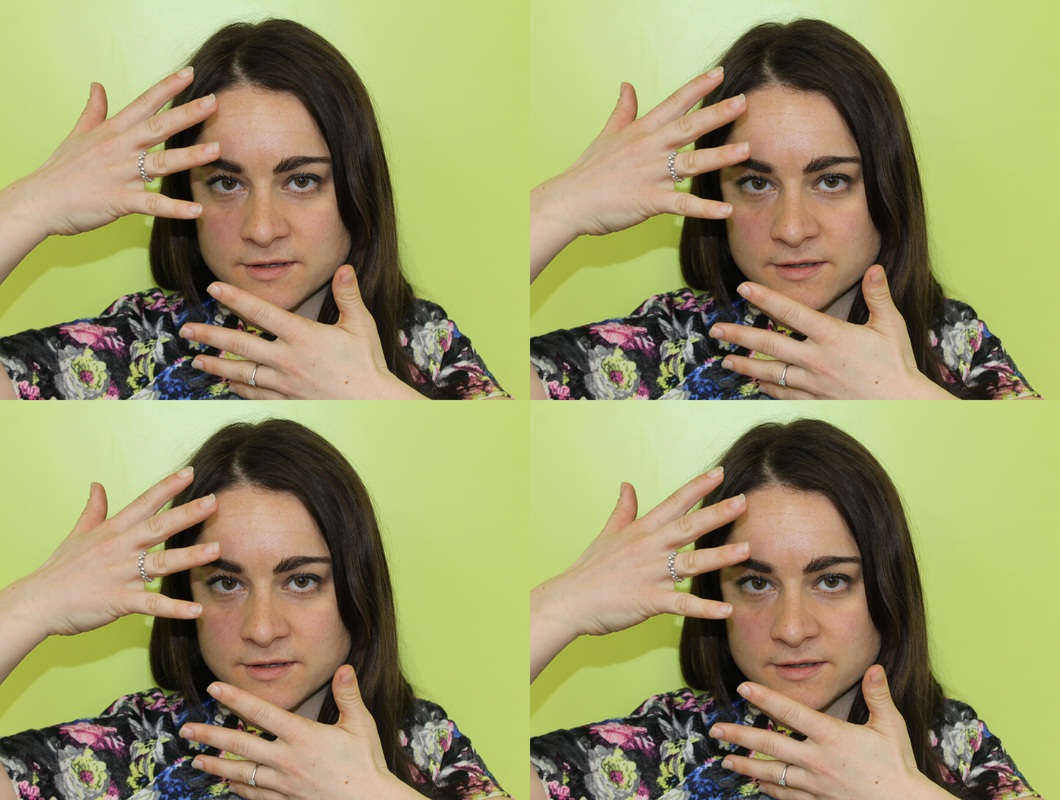
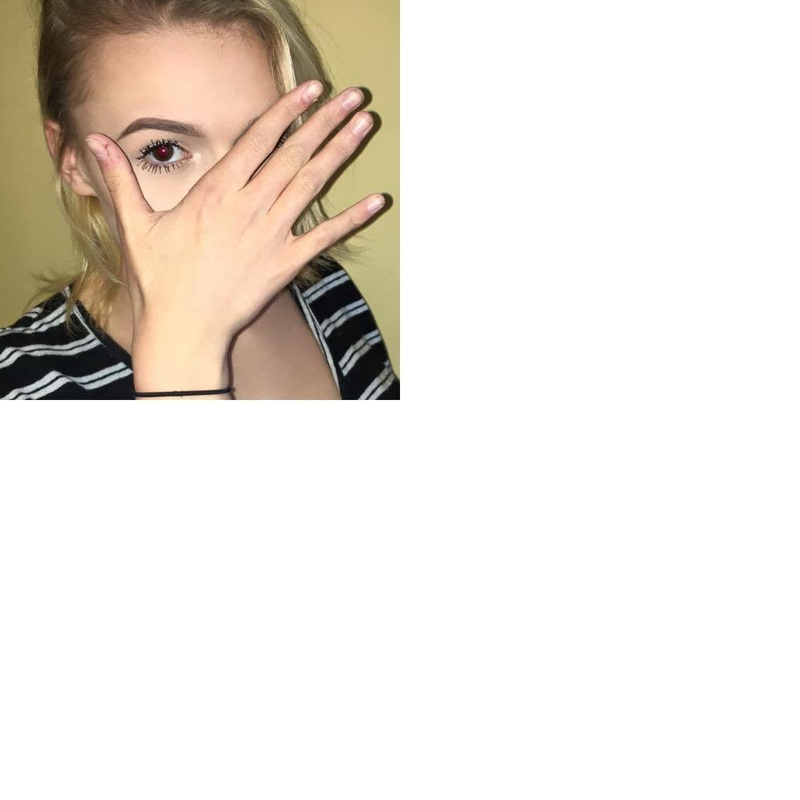
Screenshots of the first stages:
|
|
|
|
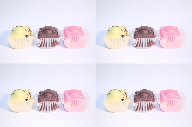
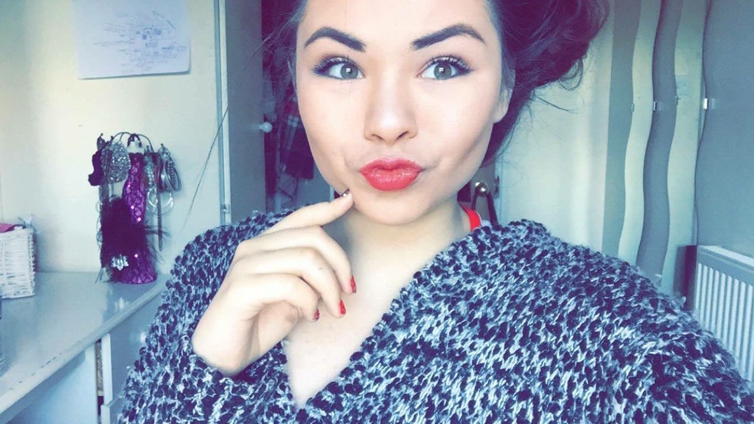
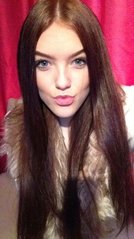
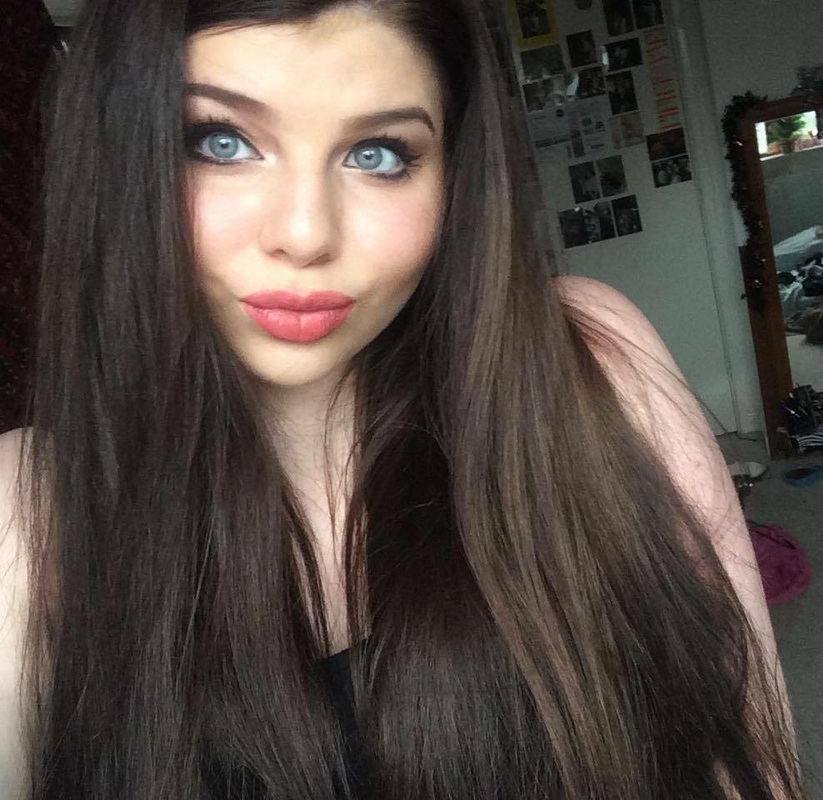
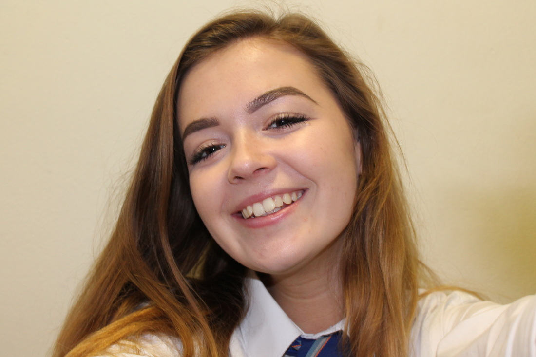
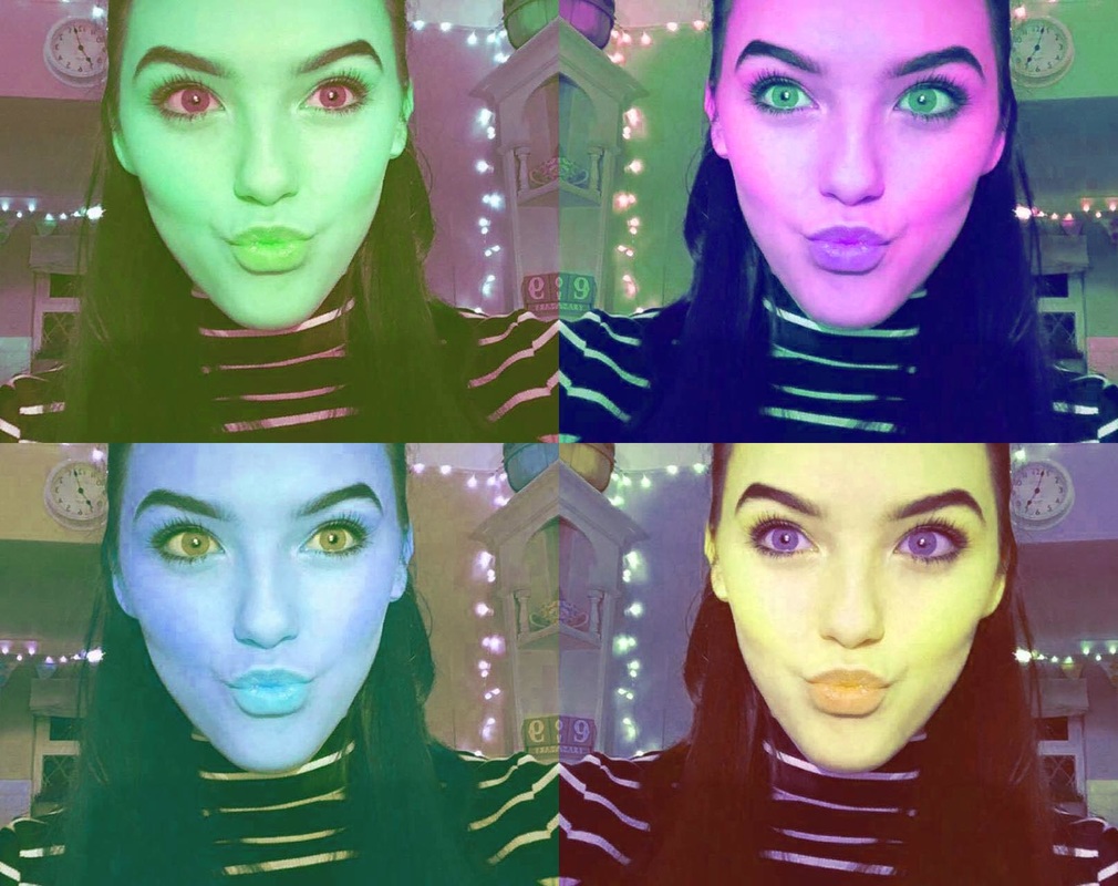
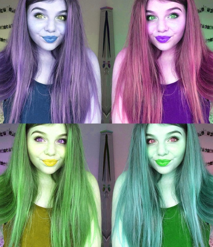
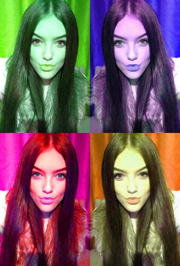
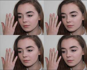
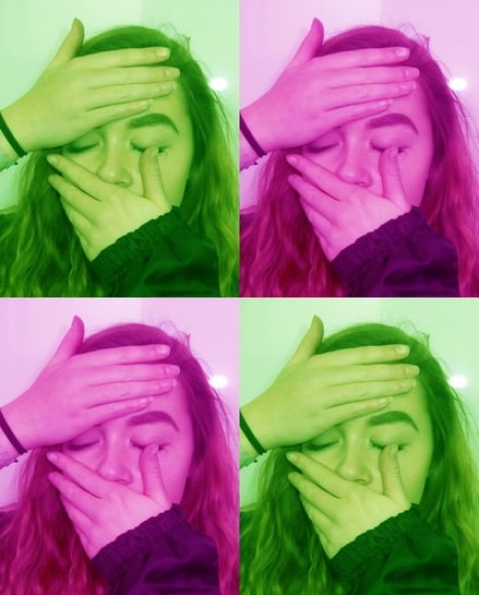
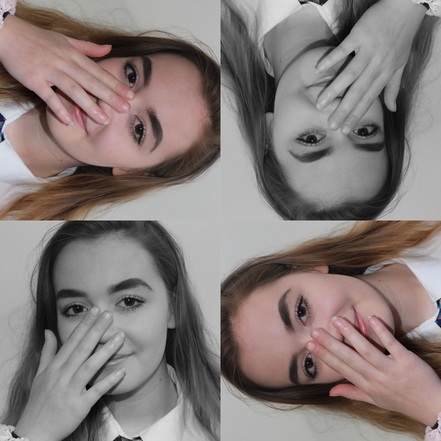
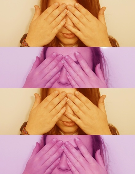
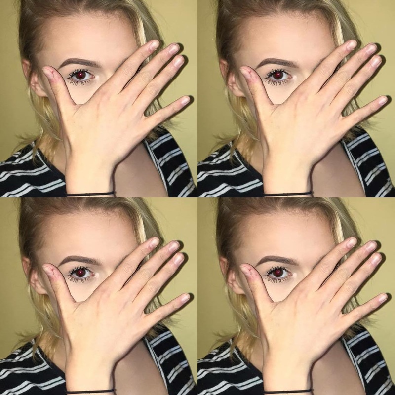
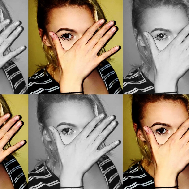
I took photos of these girls as if they were taking a selfie so it has a different unique, individual touch to each photo. I edited in the style of Warhol by multiplying the photo by 4 and giving each photo a different hue and saturation.
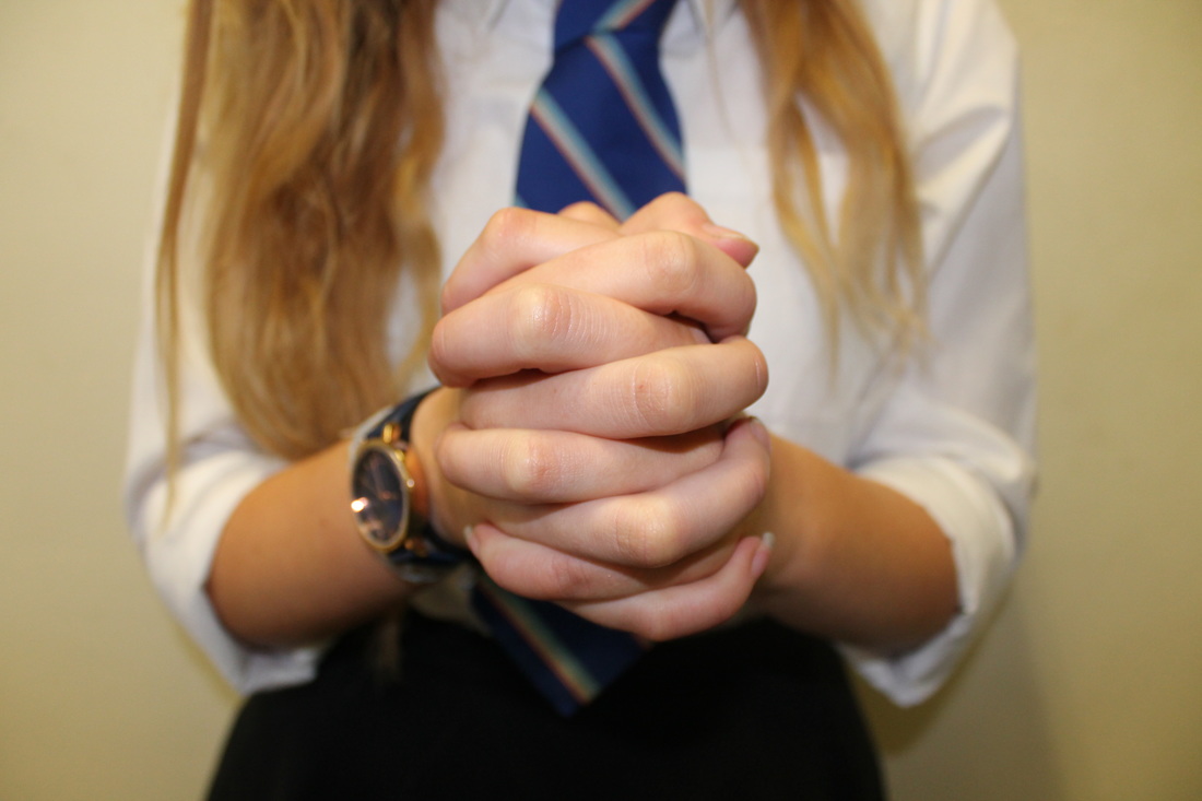
Photo-shoot in response to Warhol, Rankin and Makepeace
I have decided to take inspiration from Rankin and Makepeace due to their insightful perspective on hands, and also Warhol as his edits are creative and look amazing due to their colours and focus on the person.
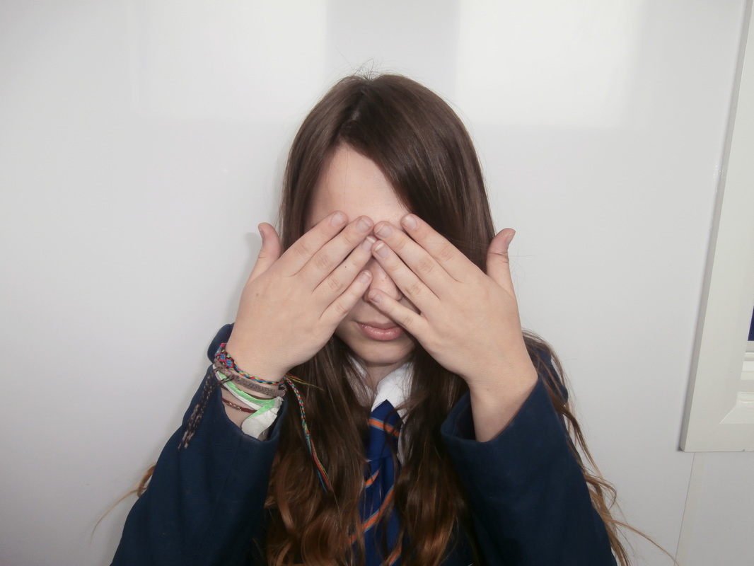
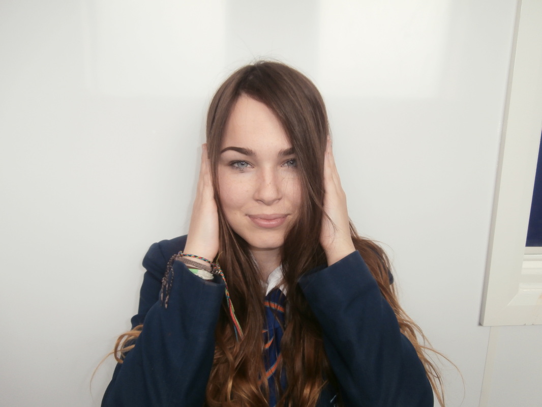
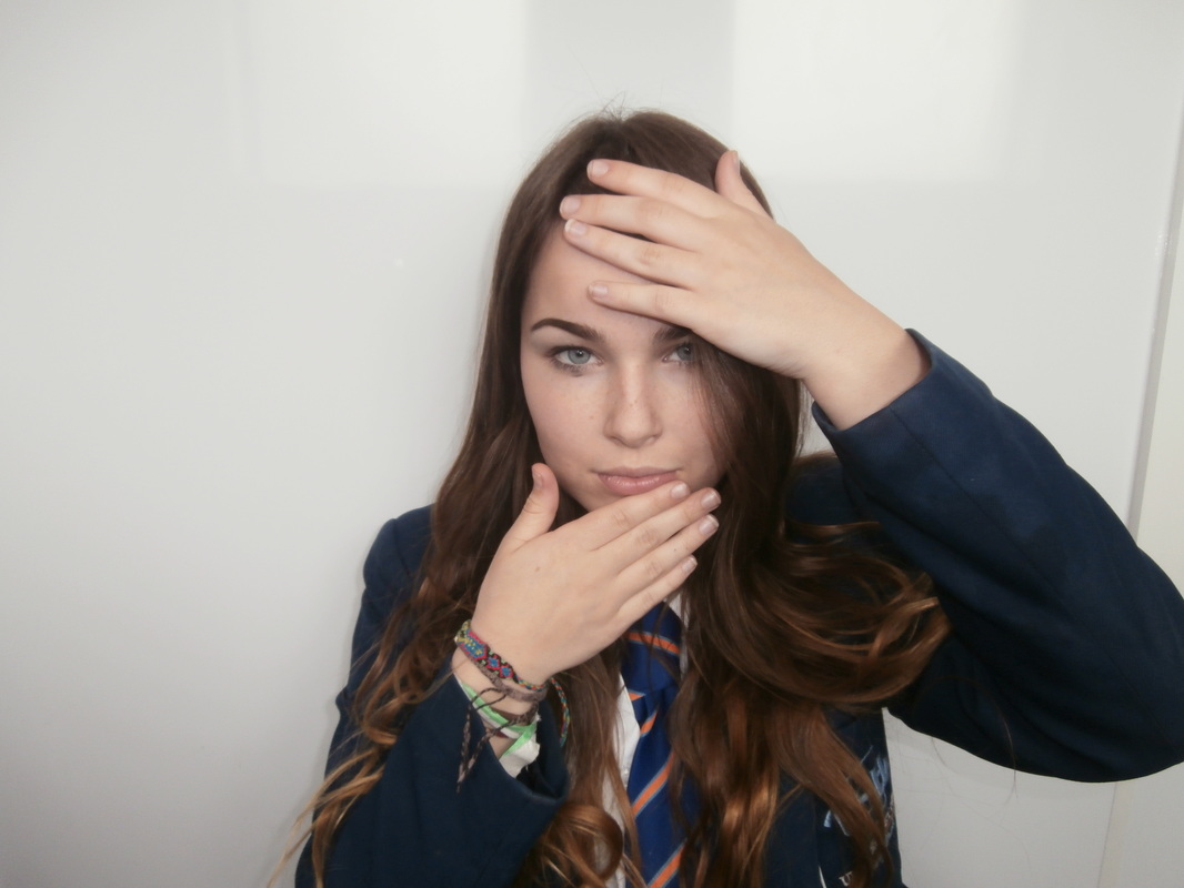
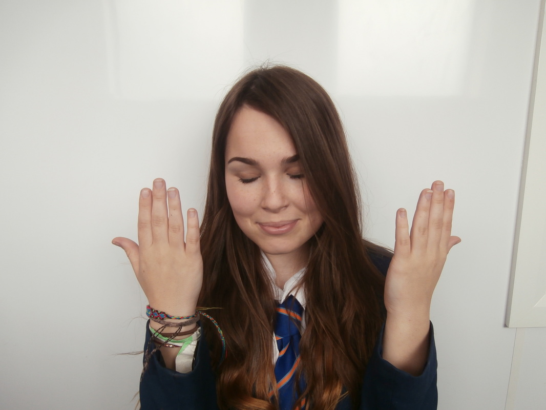

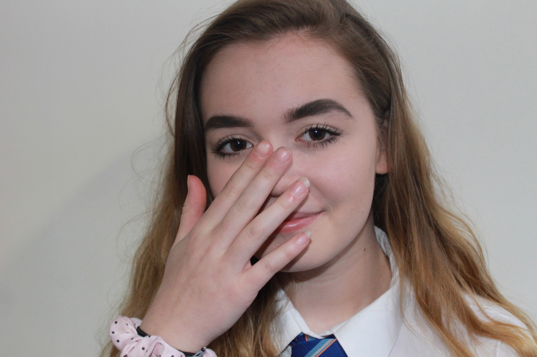

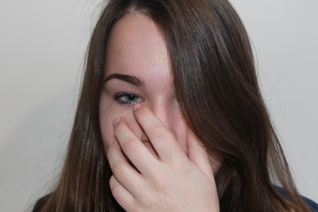
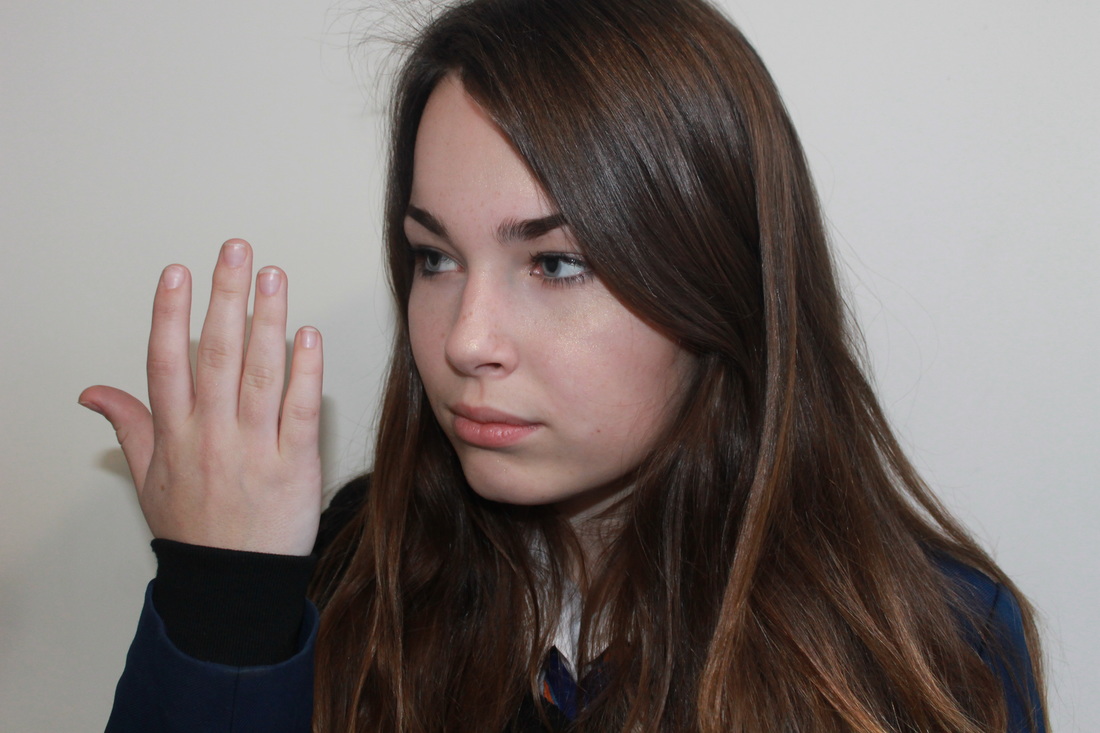
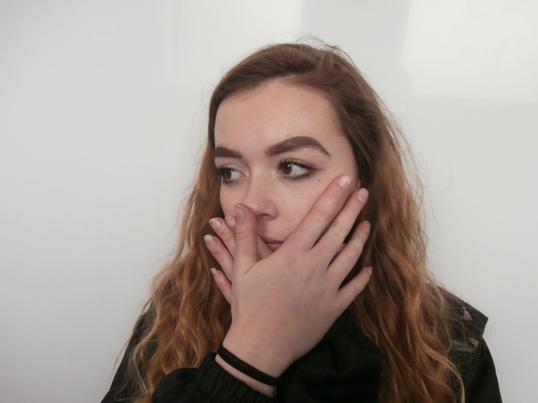
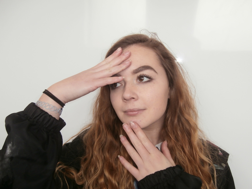
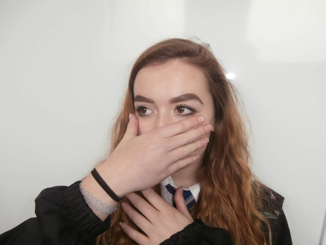
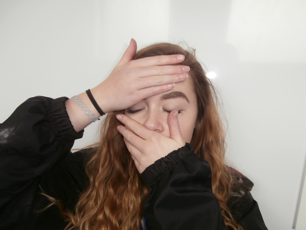
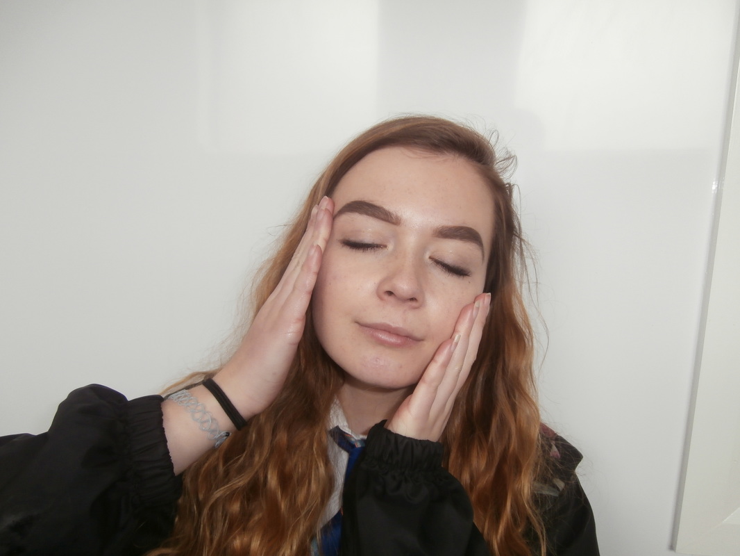
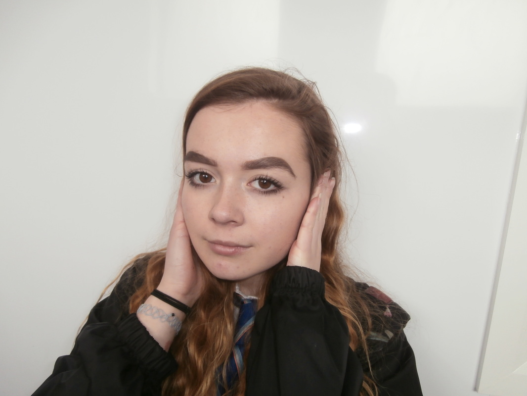
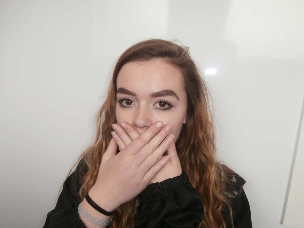
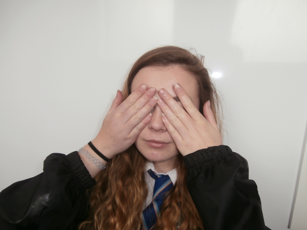
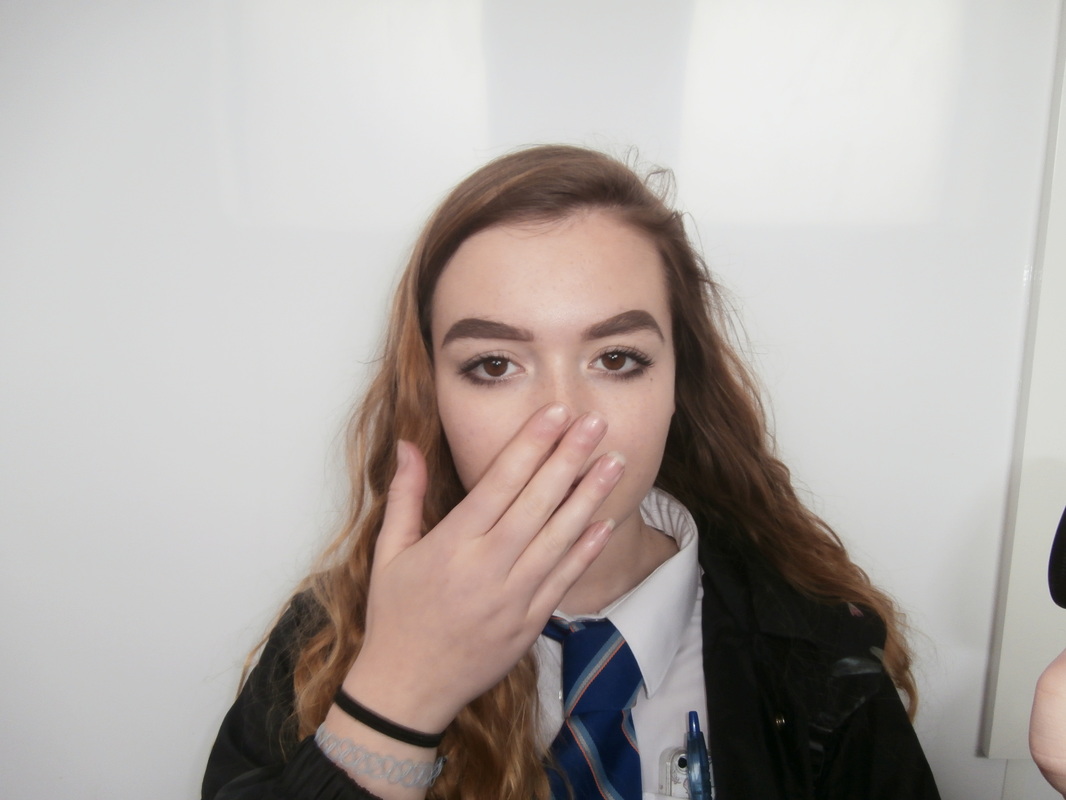
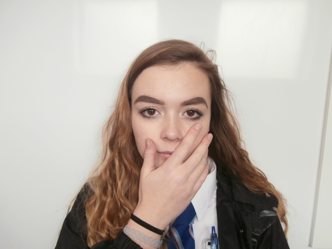
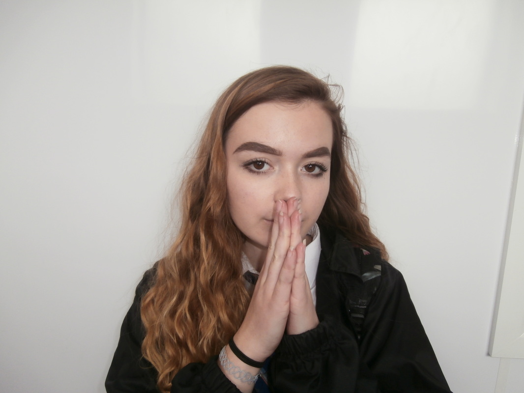
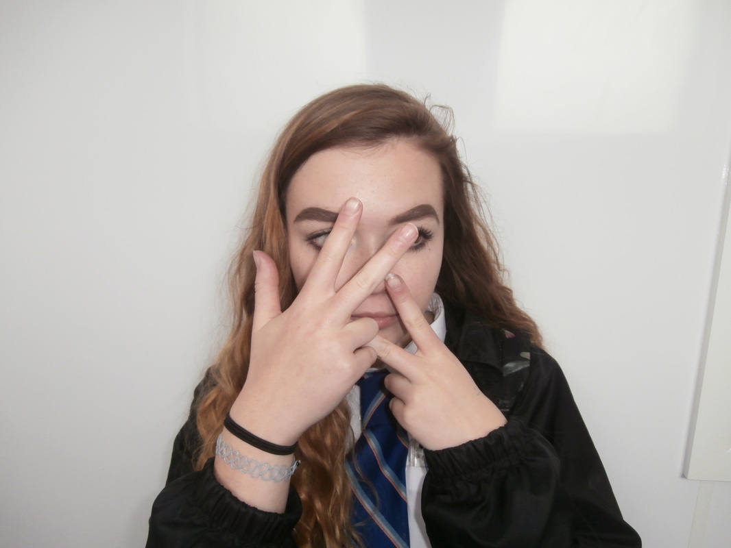
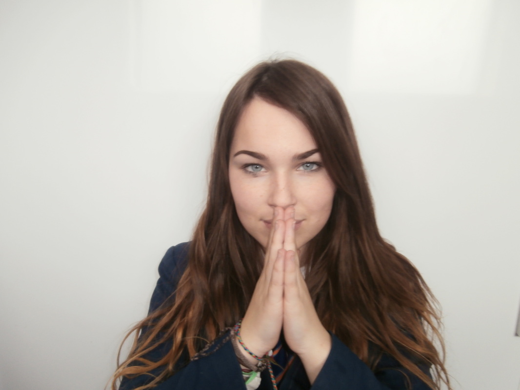
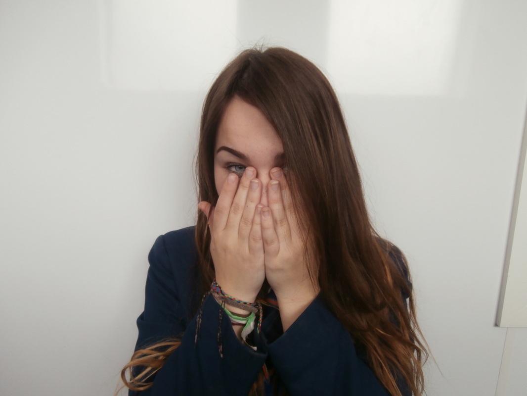
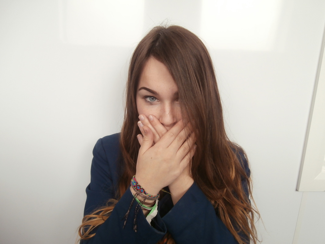

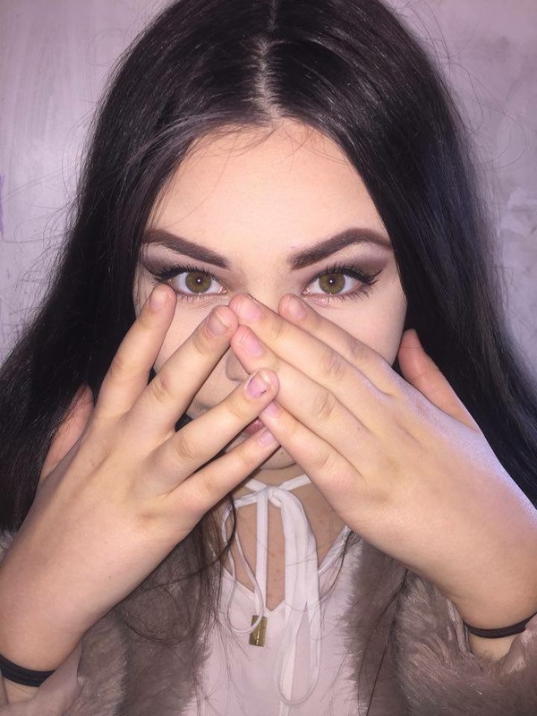
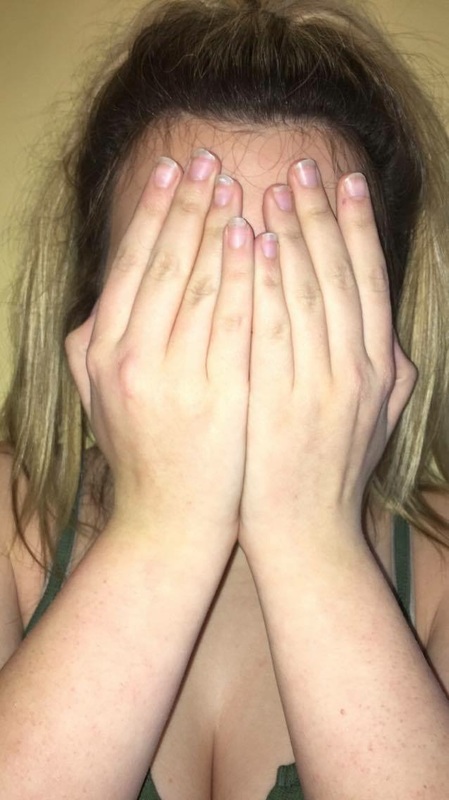
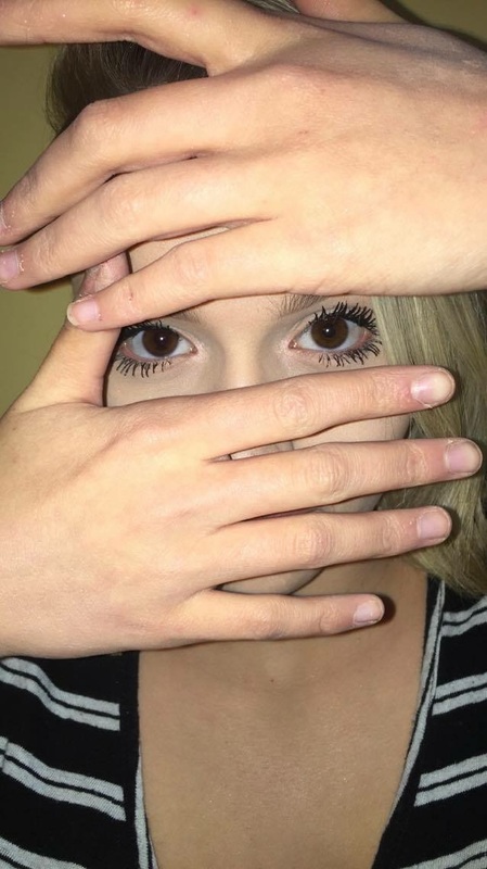
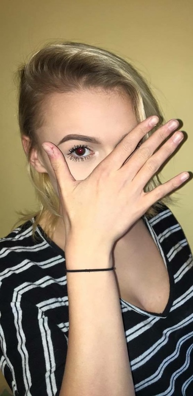
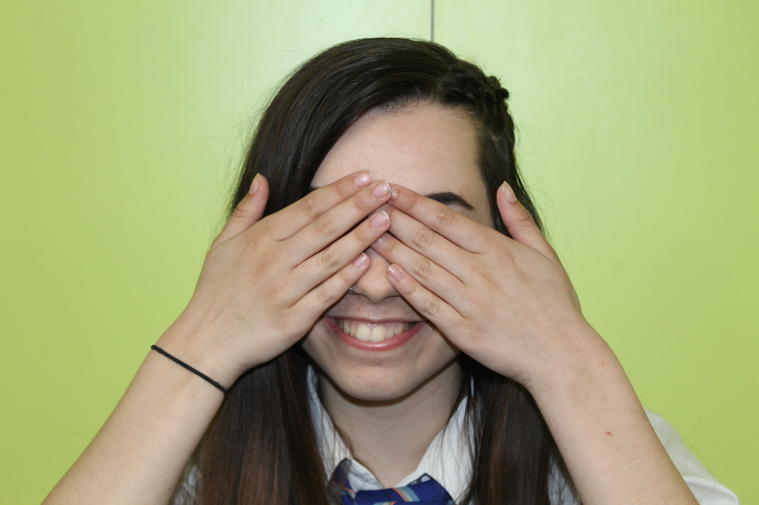
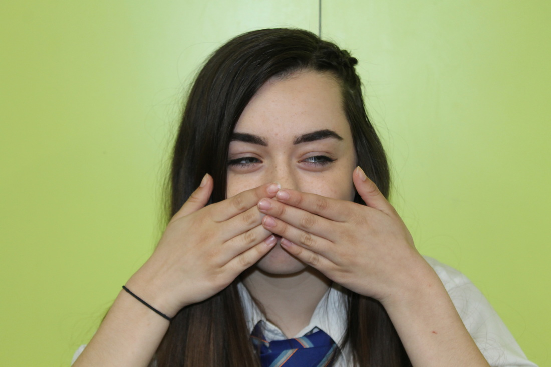
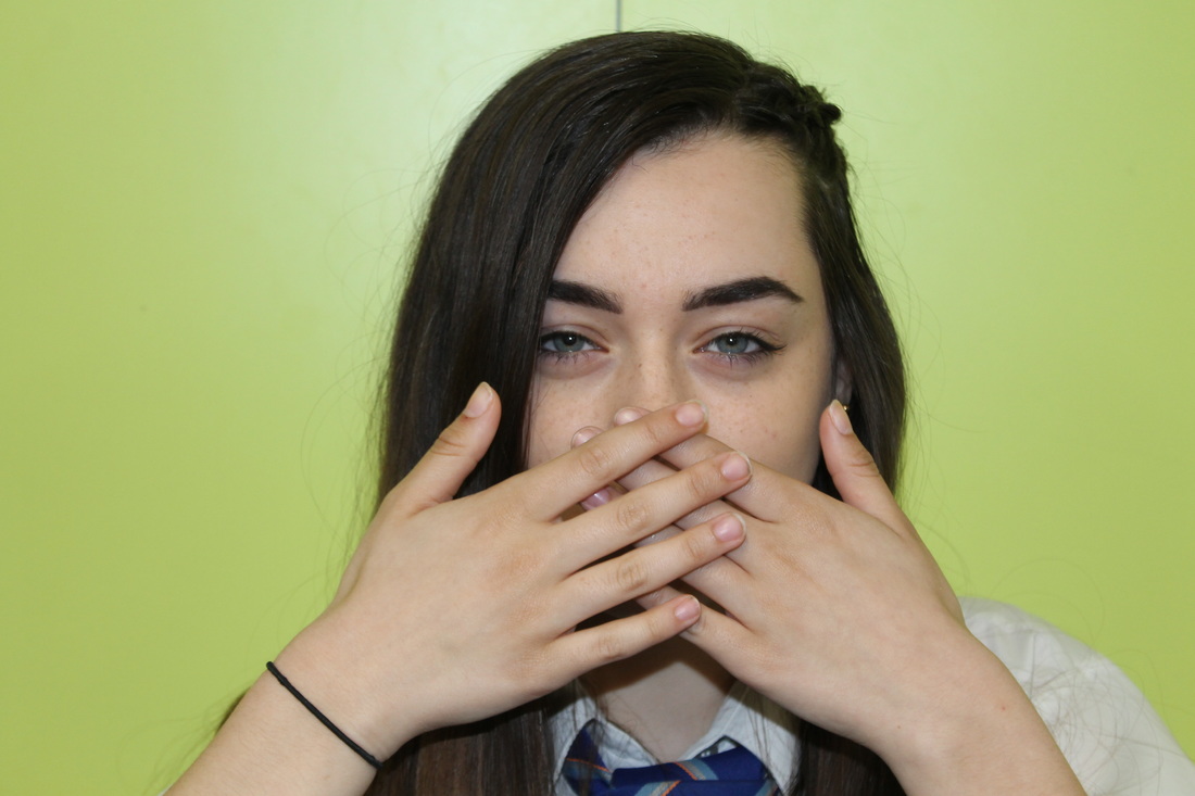
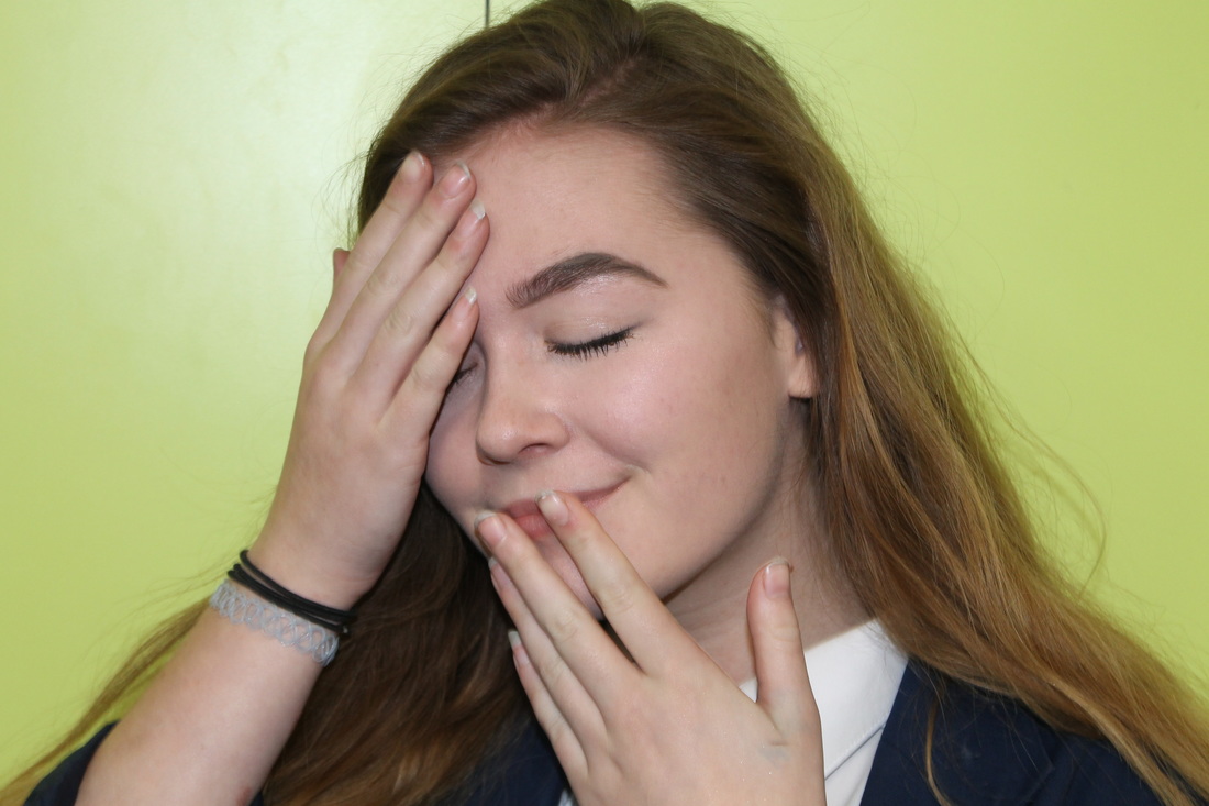
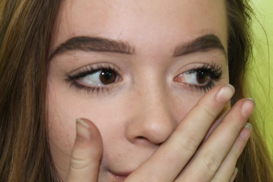
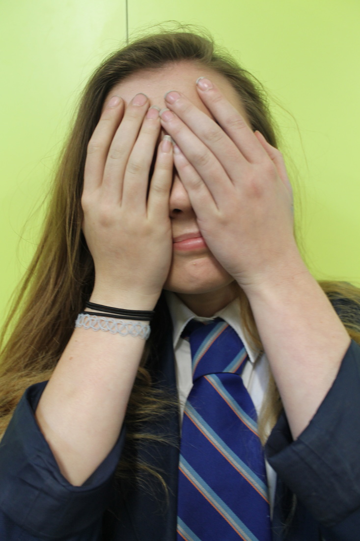
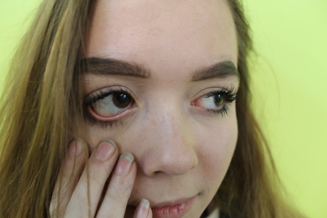
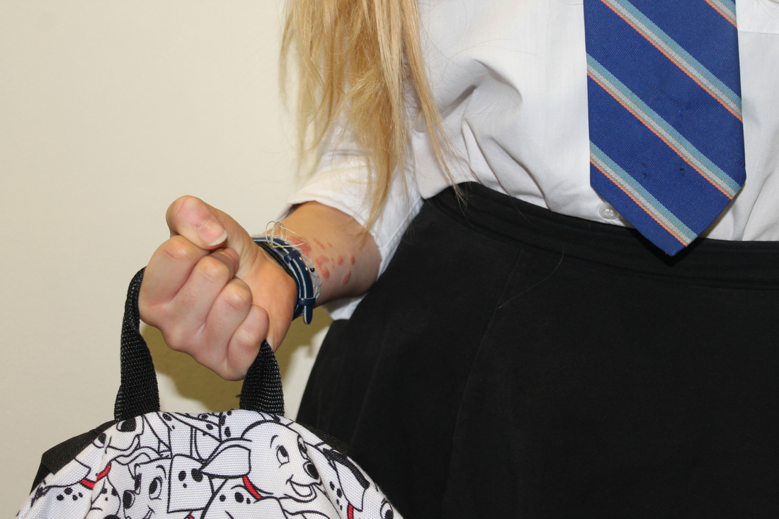
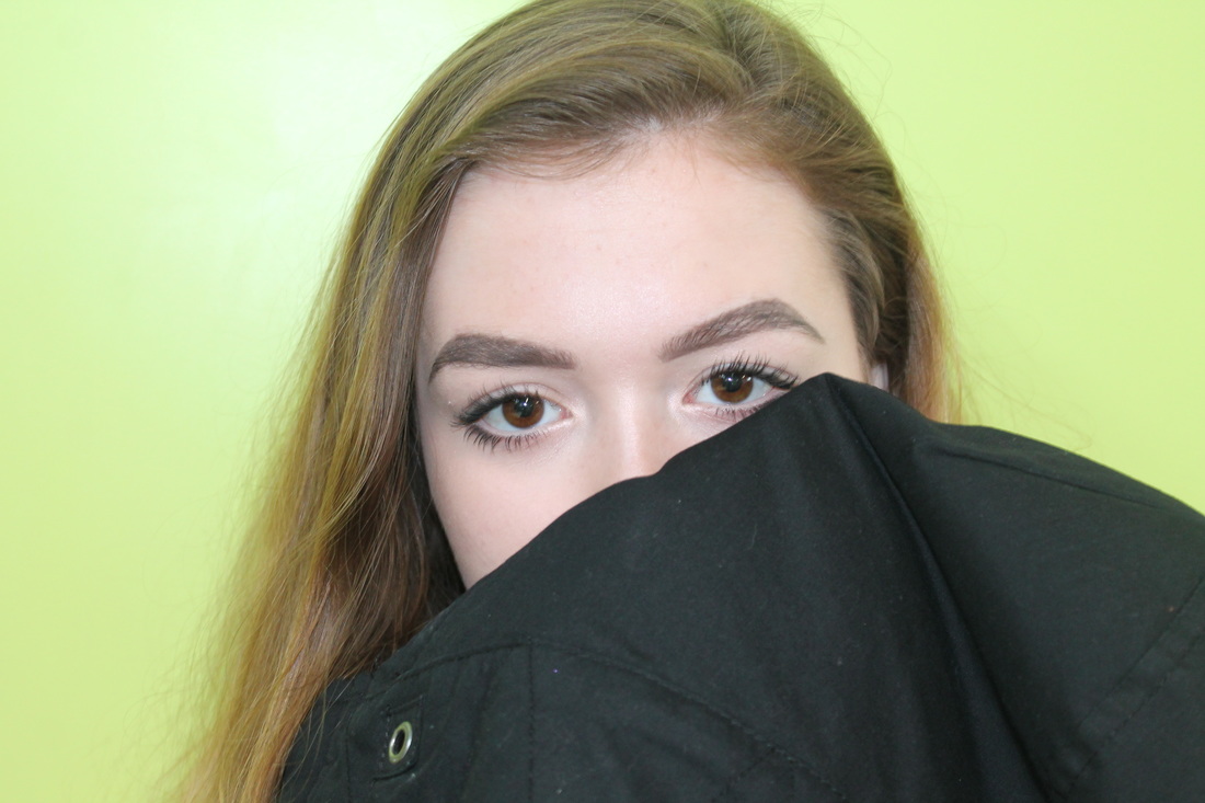
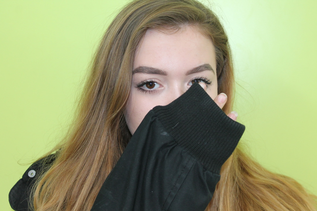
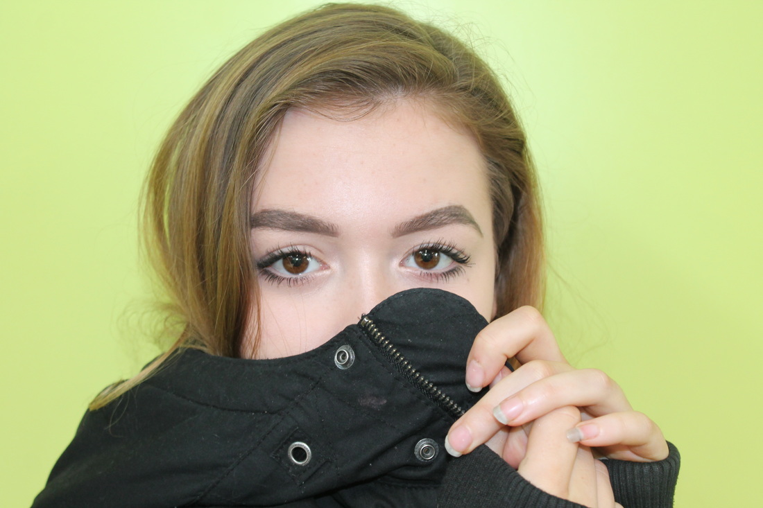
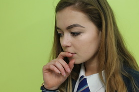
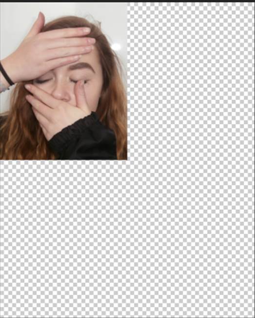
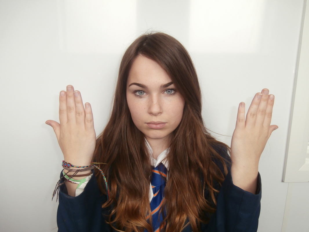
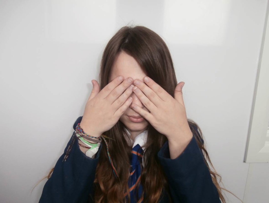
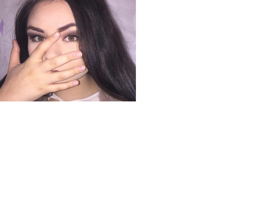
This photo shoot links to Rankin as i have taken portraits of people with their hands in the photo. I asked my models to pose using their hands to show their emotions rather than their faces, this way the hands are telling a story that is unique to them, linking to the Makepeace's and Rankin's photography as he focuses on hands and their uniqueness. Some of the models did the same hand gestures, meaning these emotions are common in a teenage girls life, such as hiding their faces to show where their insecurities lie.
Developing my ideas
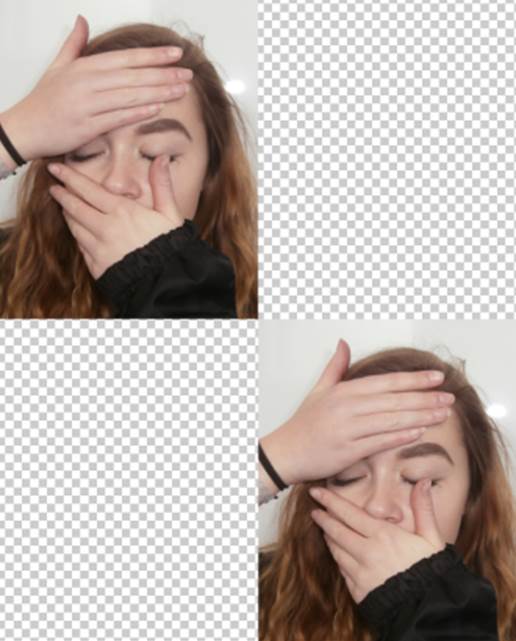
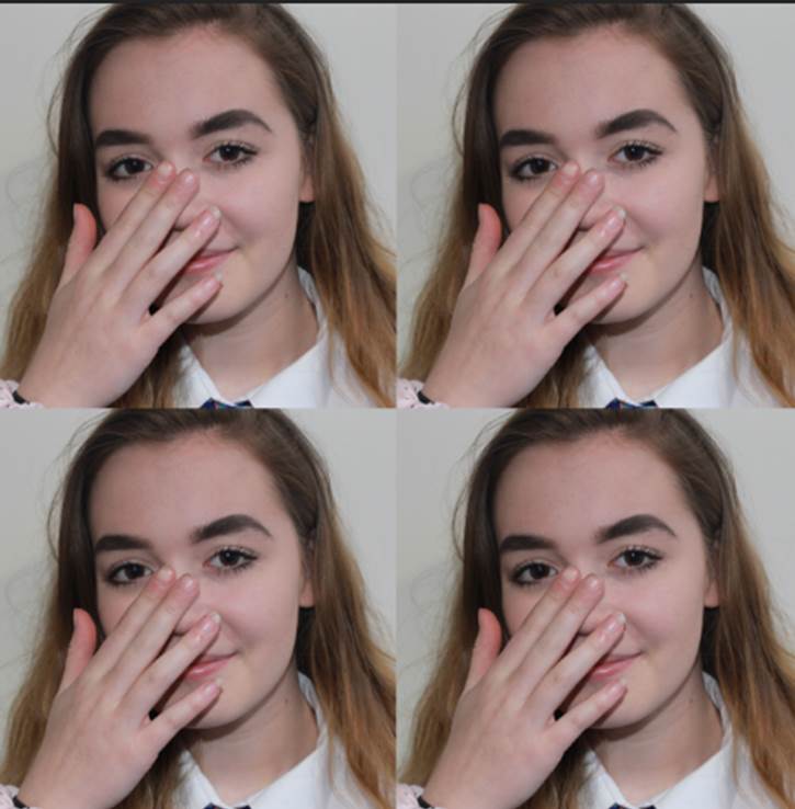
Screenshots of first stages (photo1):
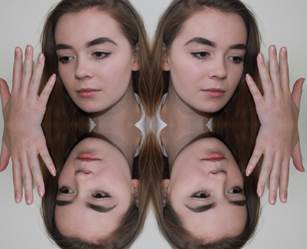
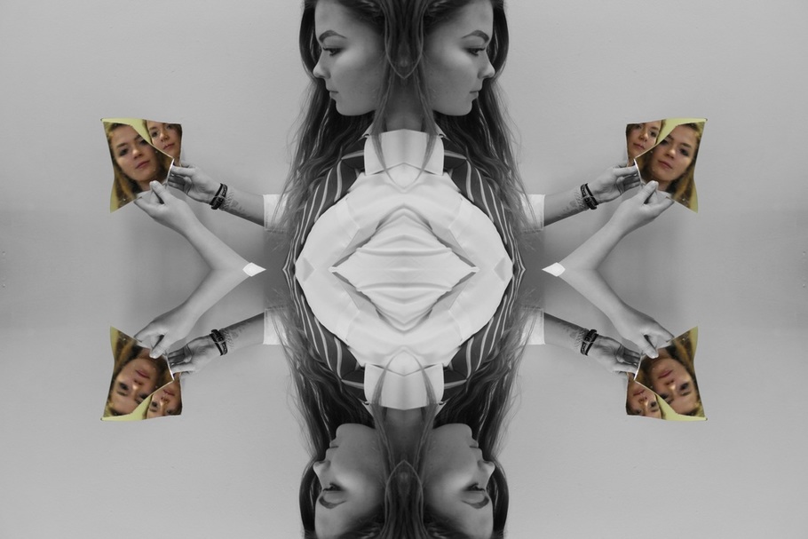
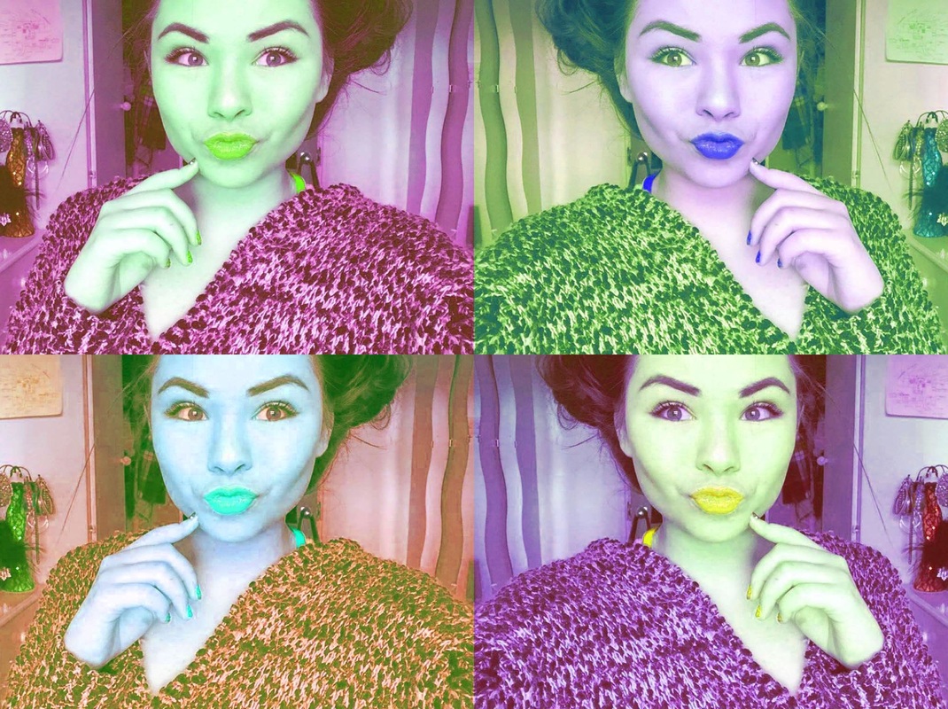
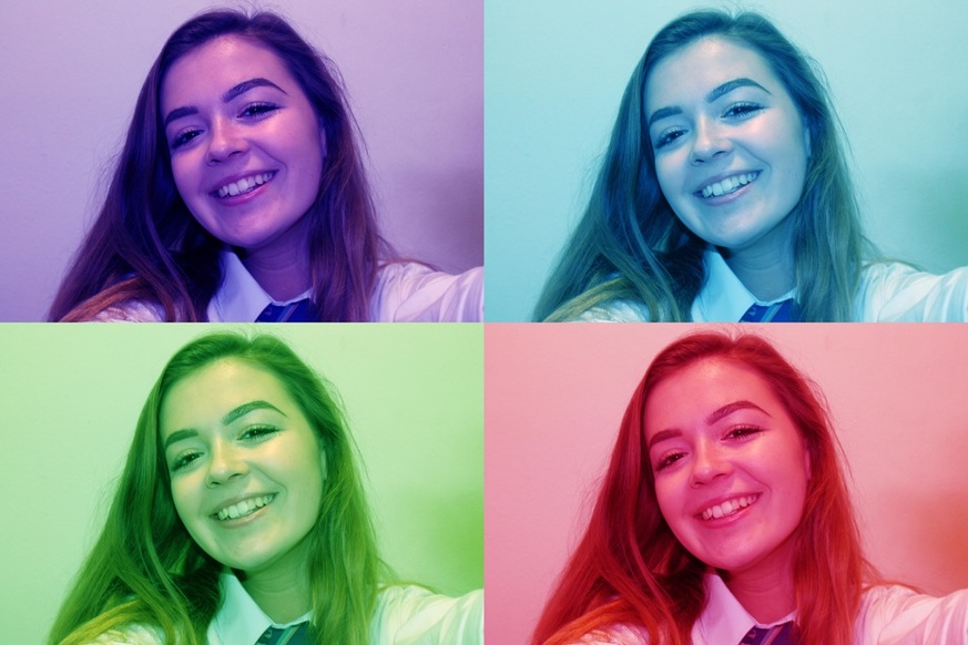
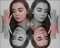
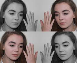
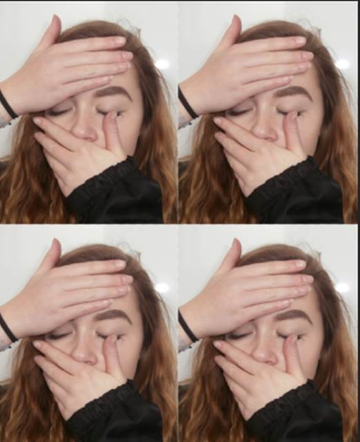
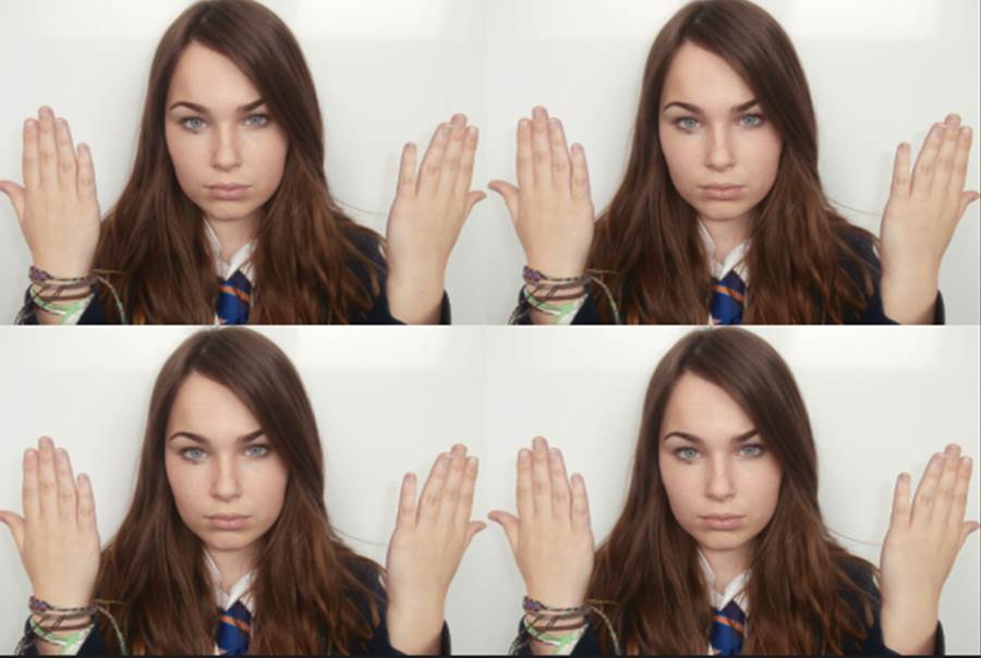
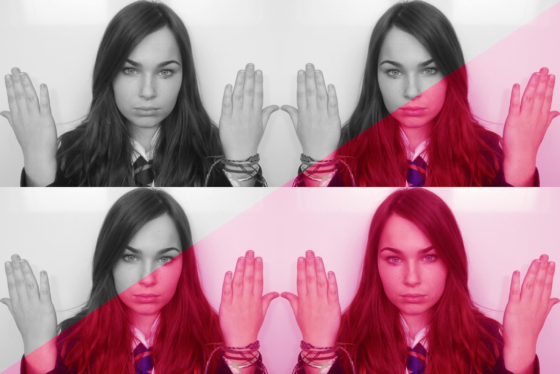
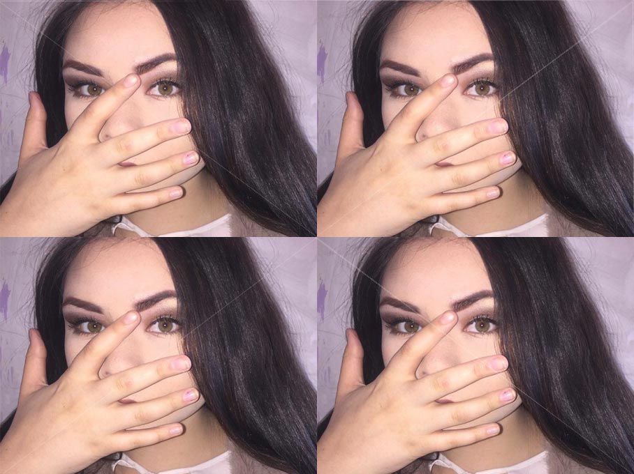
I then edited the photo's in the style of Warhol, cropping into the face and hands and multiplying it by four. After that I added my own style by being more creative and flipping the bottom two photo's as I thought it worked better with repetition as it looks the photos are a mirror image of each other.
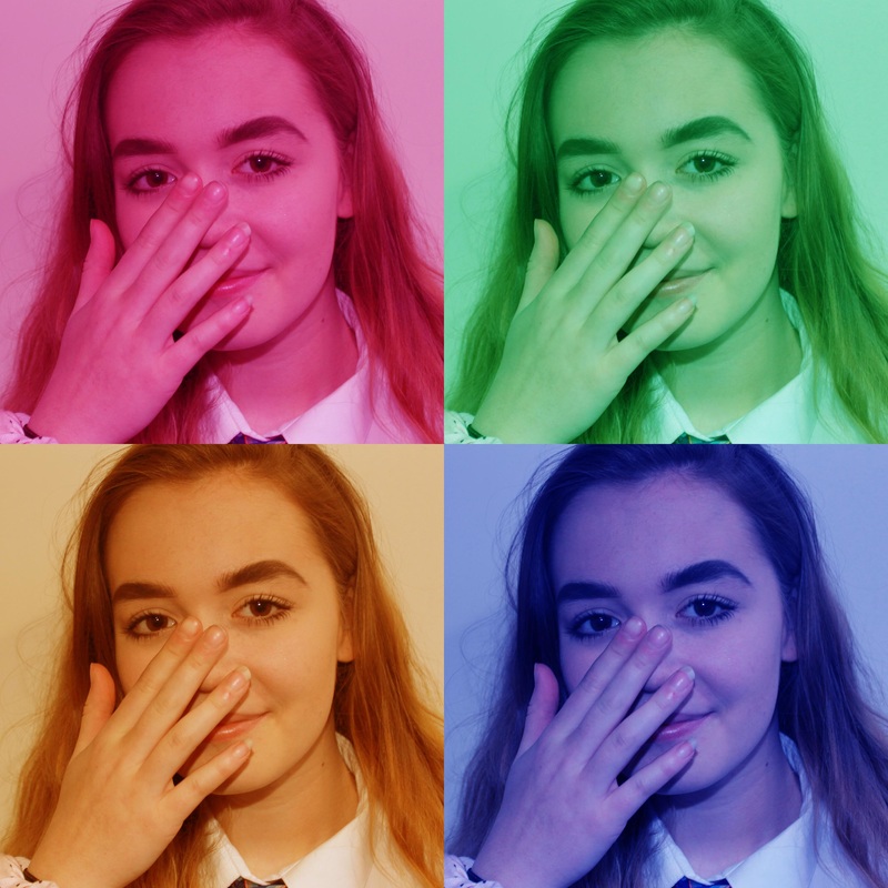
Final products (photo 1):
|
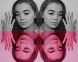
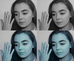
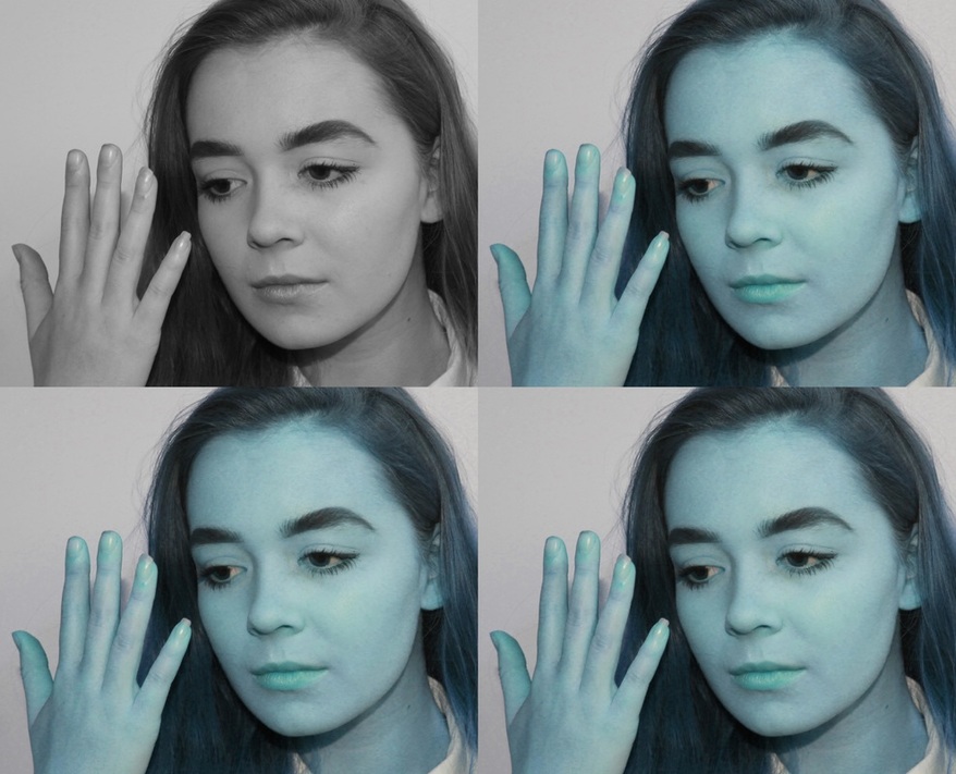
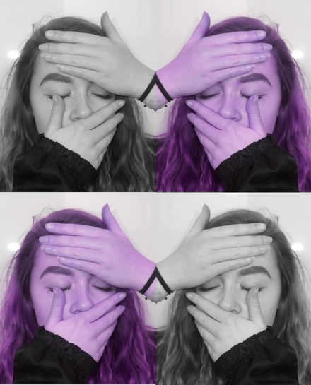
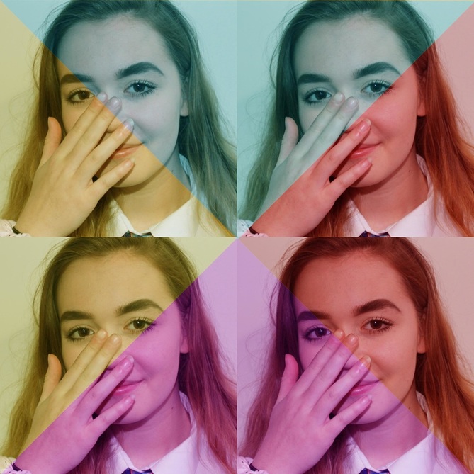
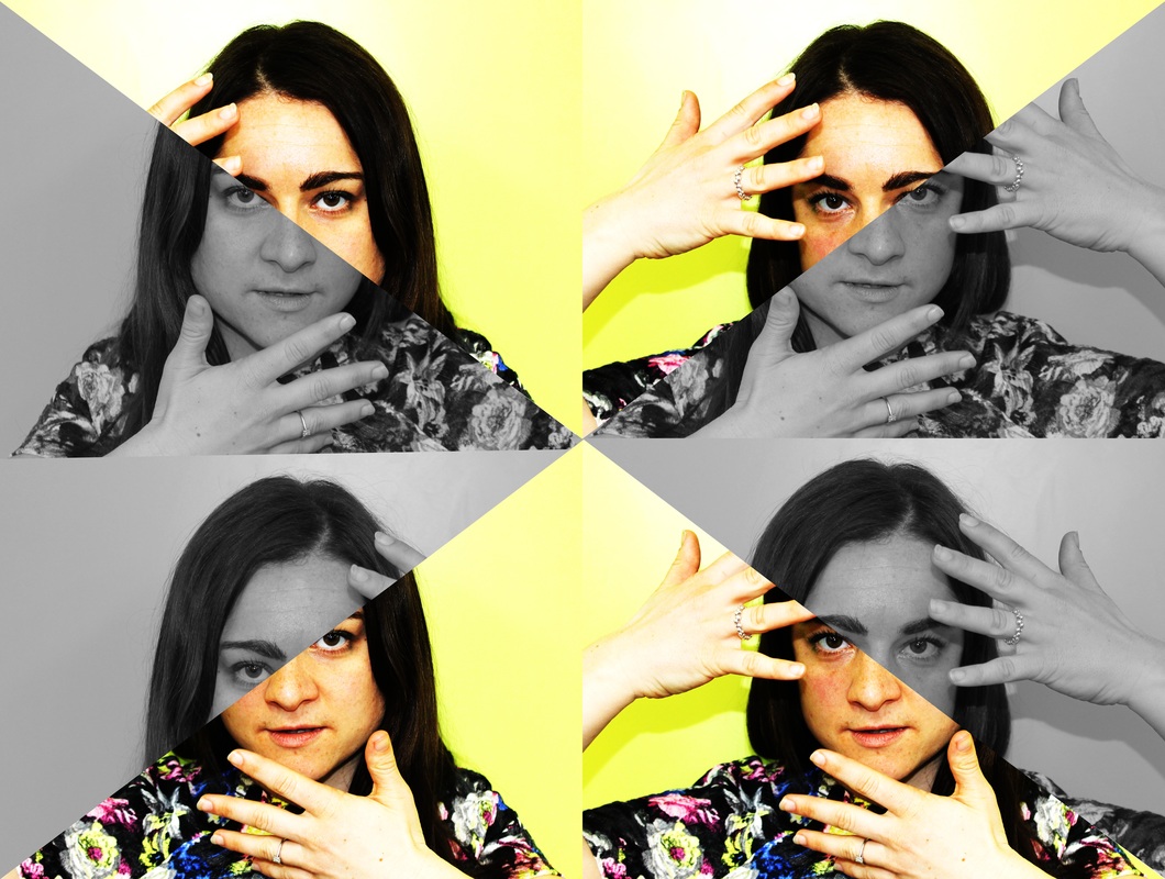
I experimented with the hue and saturation tool on Photoshop and flipped the photos around to get different products. I personally like each of them for different reasons as I like how they all show repetition in a different way. If I had to chose, the photo below would be my favourite because of the contrast, repetition and pattern of the photo.
|
|
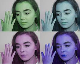
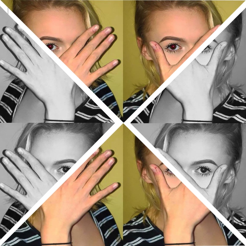
I also linked it to Warhol by using different dynamic colours for each photo.
Screenshots of first stages (photo 2):

Final products (photo 2):
|
|
Screenshots of first stages (photo 3):

Final product (photo 3):
Screenshots of first stages (photo 4):
Final products (photo 4):
|
|
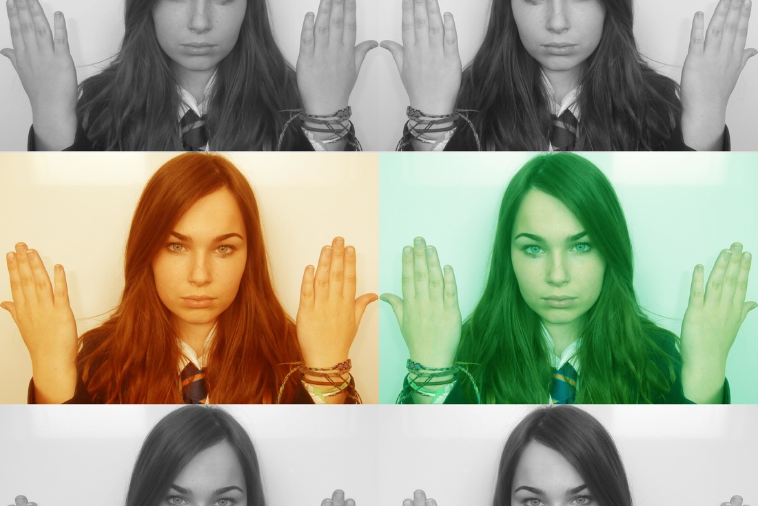
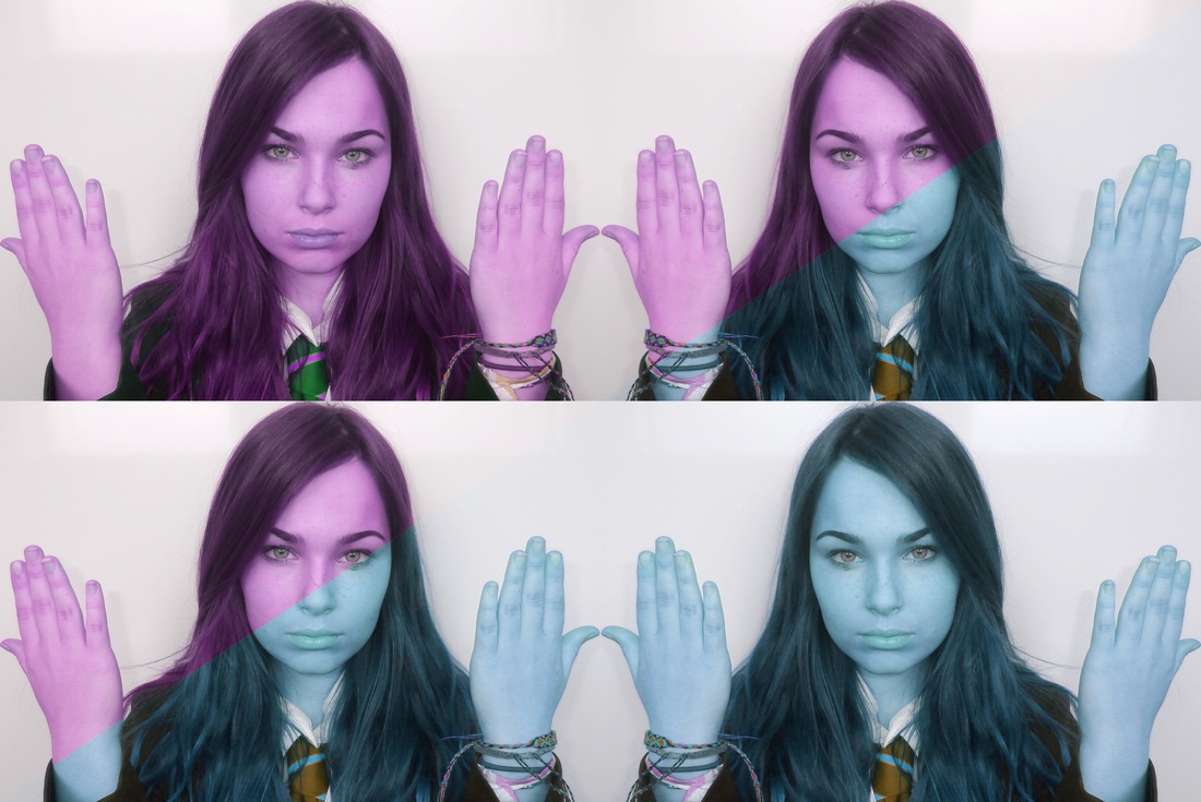
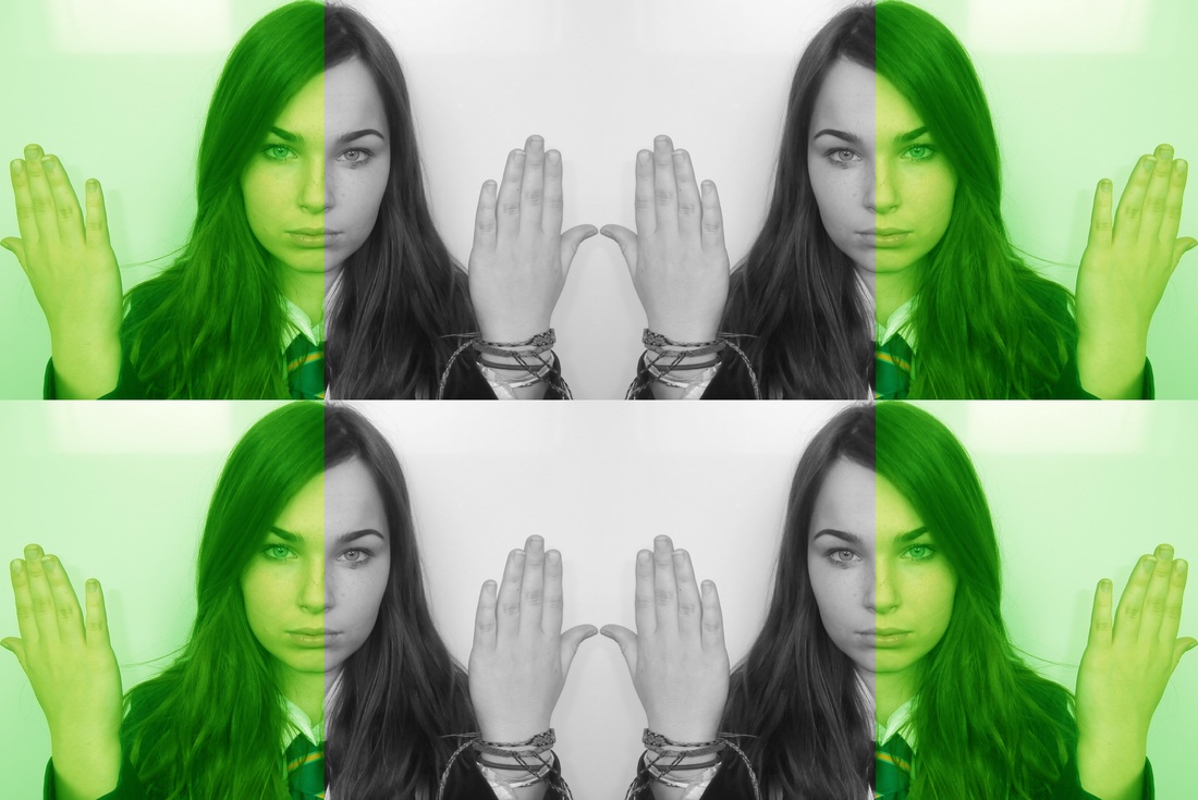
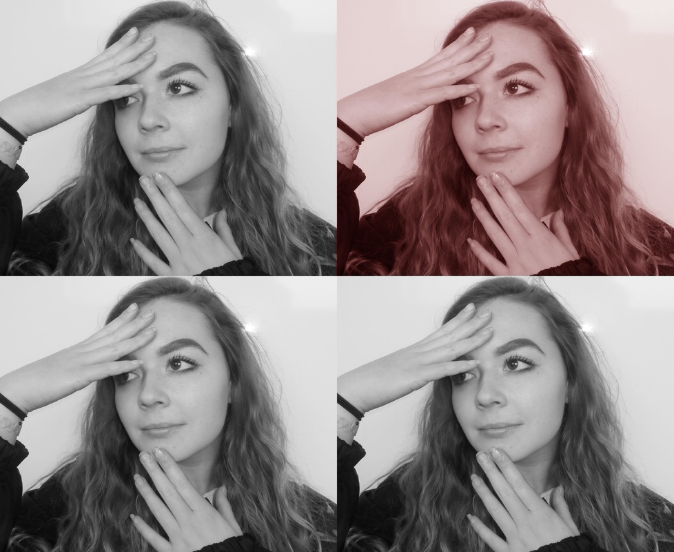
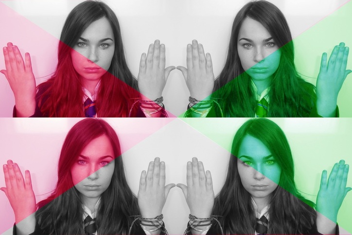
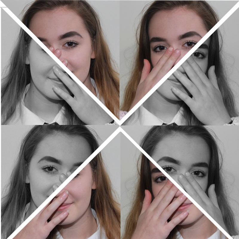
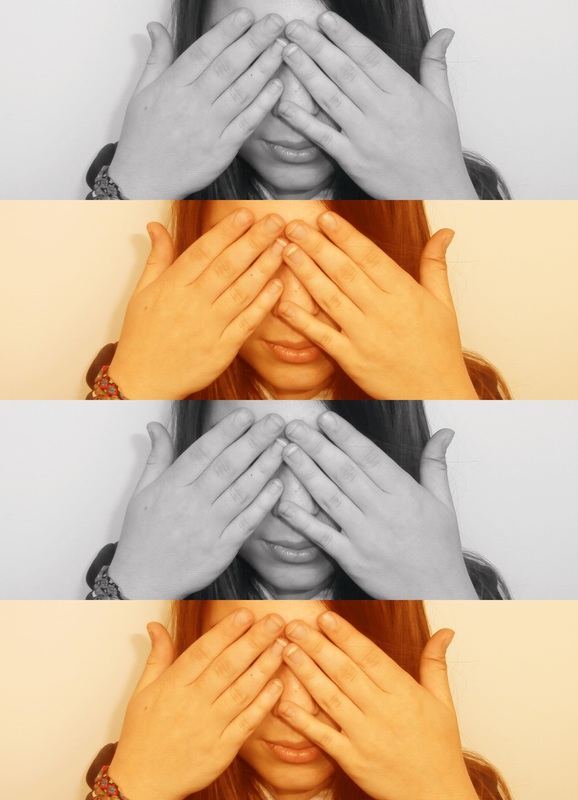
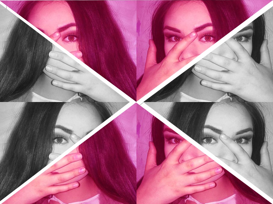
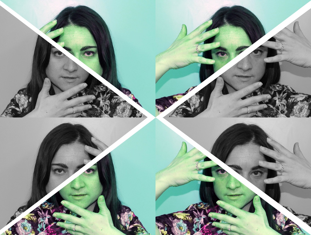
Here i have linked my work to Warhol by using bright colours for each photo, but instead of doing it the way Warhol does it, I became more creative and split the some photos as a whole diagonally and changed the colours to make a contrast and a pattern which links to repetition. Sometimes by using black and white to contrast with colour, you are able to appreciate the colours more as the bland black and white enhances the dynamic colours,
Screenshots of the first stages (photo 5):

Final products (photo 5):
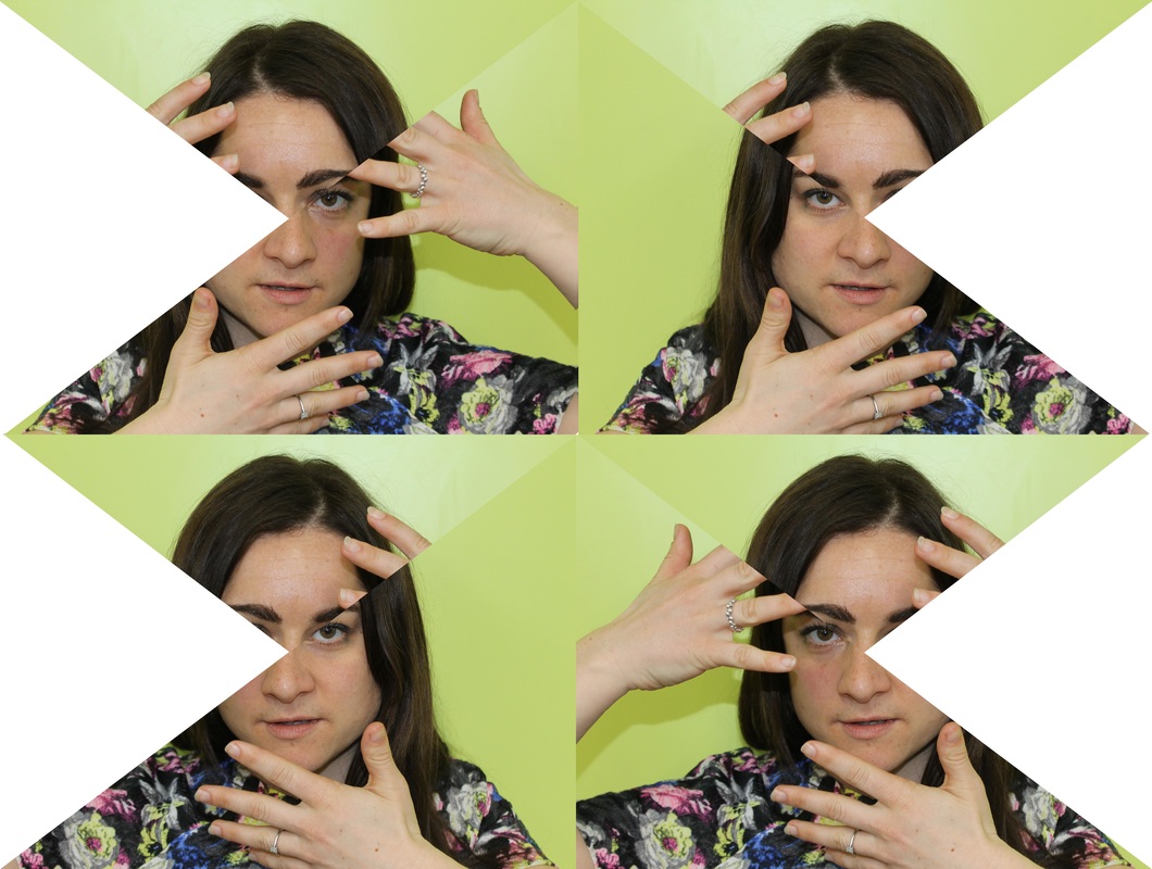
|
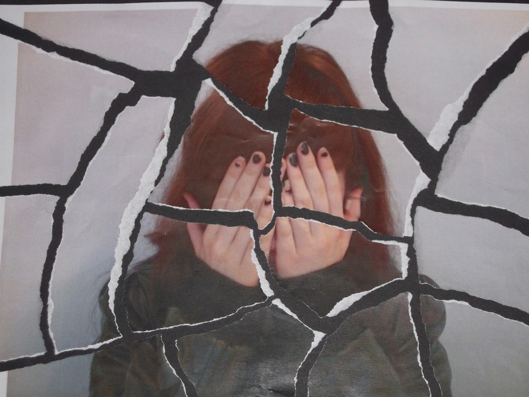
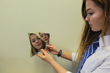
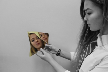
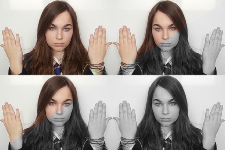
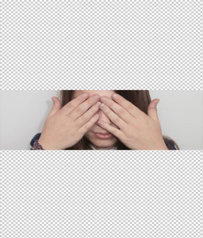
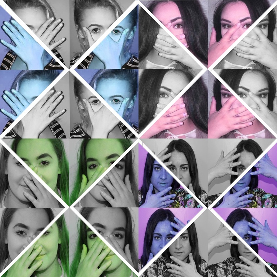
I cropped the photo into a square shape so that then it was even and easier to experiment with. Due to it being square I was able to rotate one of the 4 photos without effecting the photos outer shape. I was also abled to cut it into triangles as you can see on the left. Experimenting with the square photos allowed to find different ways to show repetition through portraits of faces and hands. As you can see on the left, by splitting the photo up the pattern has been broken but the repetition as been enhanced. |
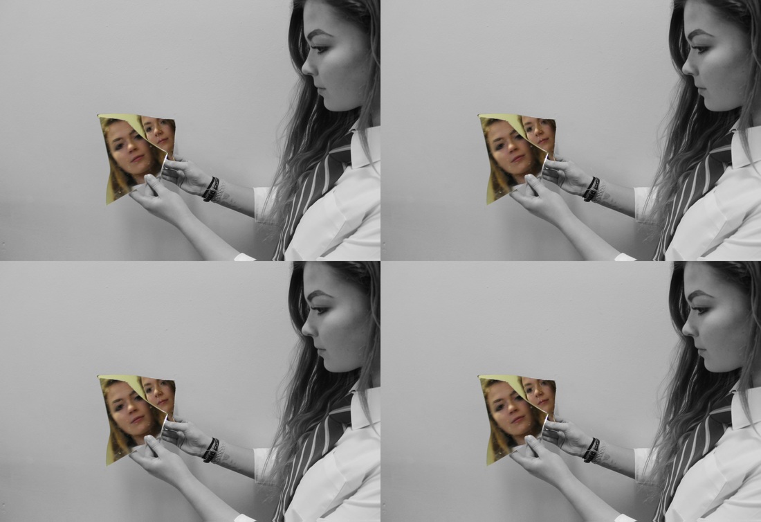
Screenshots of the first stages (photo 6):
The layout of the photographs is inspired by Warhol but the pattern of the colours was installed to enhance the repetition in the photo.
|
|
Screen shots of the first stages(photo 7):
Final Products (photo 7):
Screenshots of the first stages (photo 8):

Final products (photo 8):
|
|
Screenshots of the first few stages (photo 9):
Final products (photo 9):
|
|
I have researched John Makepeace, Andy Warhol and John Rankin during this project. I discovered Warhol and Rankin through my previous project on identity. I discovered Makepeace through researching different types of hand photographers, his work stood out to me the most. Through researching them I have learnt how to effectively show repetition, meaning and contrast. John Makepeace and Rankin taught me how to show repetition and meaning. Warhol showed me how to show contrast through colours.
I explored the theme of repetition in hands and faces through portraits. My first thoughts of the theme was that portraits are interesting and that having the perspective of ' everyone has faces and hands, but they're unique to us and have different meanings to us, for example, some make up models will favour their faces over her hands, but some diggers would favour their hands over their hands' on the portrait will make enhance it's depth and meaning. My ideas changed as I was developing my ideas as the more I experimented with Photoshop, the more creative I became, slicing the images, rearranging them and spacing them out was a technique I only discovered during the end of the project.
I explored the theme of repetition in hands and faces through portraits. My first thoughts of the theme was that portraits are interesting and that having the perspective of ' everyone has faces and hands, but they're unique to us and have different meanings to us, for example, some make up models will favour their faces over her hands, but some diggers would favour their hands over their hands' on the portrait will make enhance it's depth and meaning. My ideas changed as I was developing my ideas as the more I experimented with Photoshop, the more creative I became, slicing the images, rearranging them and spacing them out was a technique I only discovered during the end of the project.
Final Piece:
My final piece is colourful, interesting and deep with meaning, showing off the use of patterns and repetition. I was hoping to create a photograph which had meaning, and was shown through repetition. I think I have achieved that. I think I have successfully explored the theme of repetition as I have looked at repetition of hands, faces, people, shapes, reflection, colours and patterns. If I had more time I would of looked for a deeper meaning behind my photography that I could show through the use of repetition, something like Déjà vu. The reason my photography is personal to me is because it was my own original idea to express the uniqueness of hands and faces through repetition, meaning I take pride in that idea and all of my photographs. I hope that the viewers will enjoy my photography and will understand how the photographs link to their meaning.
